Capabilities
Rendering and replacing components
The Customizations API allows developers to render predefined components on several sections of their sites. The premise of this API is to create a set of components that can be easily used and composed, in order to render additional components to certains sections of the page, and make these types of customizations as easy as possible, while reusing LumApps code and components.
In order to understand the possibilities that we have with this API, we need to first define the different elements that compose a Customization. These components are:
-
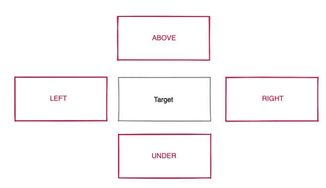
Target: This is the component of the page that we want to use as reference for our customization. This can be considered as the X coordinate for where to place our customization, and there is a predefined list of components that are marked as targets.
-
Placement: This is where we are going to add our customization around that target. This can be considered as the Y coordinate for our customization, and the possible values for this placement depend on the component to be customized. This placement usually goes from above, under, to the left or to the right of the component, with some components having the possibility to be entirely replaced. It is also worth mentioning that not all targets are compatible with the full list of placements depicted here. More information on this on the components section.
- Component to render: Basically this is what we want to render at the X and Y coordinates that we provided for target and placement.
As an example, inserting the following code in your LumApps site will display a message between the header and all pages:
window.lumapps.customize(({ targets, components, render, session, placement, constants }) => {
    const { Message } = components;
    const { Kind } = constants;

    render({
        placement: placement.ABOVE,
        target: targets.PAGE,
        toRender: Message({
            className: 'general-message',
            kind: Kind.info,
            children: 'Message above all pages',
            hasBackground: true,
        }),
    });
});

Disabling components
This API allows disabling certain components, which will prevent them from displaying on the page, as well as avoiding any XHR requests or downloaded JS that may be related to the disabled component.
In some scenarios, disabling a component might need some extra CSS added to the page in order to adapt the customized UI to the expected outcome. In order scenarios, components can be disabled from a visual perspective, but XHR requests related to the component will still be executed. This is usually related to replacing a given component with a custom one, while reusing the data retrieved from the backend. More information on this on the components section.
As an example, inserting the following code in your LumApps site will disable the Contribution button located on the top bar.
window.lumapps.disable('contribution-button');
Before executing the code:

After executing the code:

Changing displayed text
In a specific set of components, developers have the possibility to change the main text displayed on a specific component.
For example, executing the following snippet will change the placeholder displayed on the Search box from Search to Explore, located at the top bar:
window.lumapps.setText('search-box', {
    en: 'Explore',
    fr: 'Explorer',
    es: 'Explorar'
});

Public Site Customizations
By default, customizations only execute for authenticated (logged-in) users. However, you can configure customizations to also run for anonymous users on public sites by using the shouldRenderOnPublicSites configuration option.
Requirements
To enable public site customizations, the following requirements must be met:
- Feature Flag: The
public-js-customizationsfeature flag must be enabled for your organization - Organization Setting: An administrator must enable “Allow anonymous execution of customizations” in the Back Office Advanced Settings page (under the Customization section)
- Configuration: The customization must explicitly set
shouldRenderOnPublicSites: truein its configuration
Usage Example
// This customization will run for both authenticated and anonymous users
window.lumapps.customize(({ render, targets, placement, components }) => {
    const { Message } = components;
    const { Kind } = constants;

    render(targets.HEADER, placement.AFTER, components.Message({
        kind: Kind.info,
        children: 'Welcome! This message is visible to everyone.',
        hasBackground: true,
    }));
}, { shouldRenderOnPublicSites: true });
Checking User Authentication Status
You can check whether a user is authenticated using the session.isConnected property to conditionally render different content:
window.lumapps.customize(({ render, targets, placement, components, session }) => {
    const { Message } = components;
    const { Kind } = constants;

    const message = session.isConnected
        ? 'Welcome back!'
        : 'Welcome! Please log in to access more features.';

    render(targets.HEADER, placement.AFTER, components.Message({
        kind: Kind.info,
        children: message,
        hasBackground: true,
    }));
}, { shouldRenderOnPublicSites: true });
Important Considerations
⚠️ Security Warning: This feature is optional and should be used carefully. The use of this feature may cause the Application to behave erratically and pose security risks. Consult with your IT and security departments before enabling this feature.
Best Practices:
- Only enable public customizations when necessary for your specific use case
- Avoid exposing sensitive information to anonymous users
- Test thoroughly on public pages before deploying
- Consider the performance impact on public pages with high traffic
- Regularly review and audit public customizations for security issues
For more detailed information, see the Public Site Customizations Security section in the API documentation.
Components
Here you will find the list of all the components that can be customized on LumApps, with the following information:
- Description of the component to customize, and the ID associated to it.
- Whether the component is compatible with the aforementioned features
- Possible use cases for the target.
Application
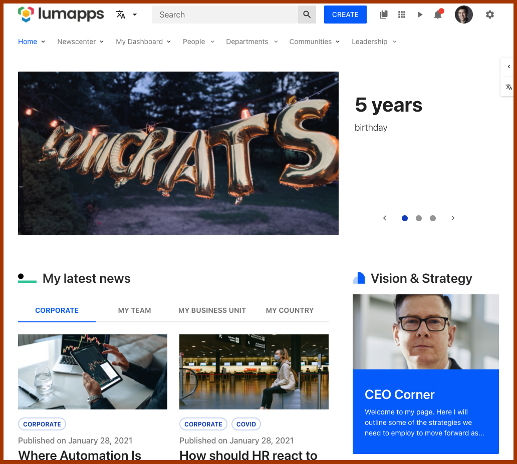
Target that allows customizing the surroundings of your LumApps application.
Compatibility
| Target ID | app |
| Description | Target that encapsulates the entire LumApps application. |
| Placements | Compatible with placements: RIGHT, LEFT * |
| Disable | No compatibility |
| Changing text | No compatibility |
Note: Using the RIGHT and LEFT placements will make the custom component display at either the left top hand side or the right hand side of the application with a position: absolute; and either right: 0; or left: 0;. Furthermore, components will be added as siblings of the main content of the application
Use cases
Bookmarks
Target that allows customizing the bookmarks (also known as App launcher) component

Compatibility
| Target ID | bookmarks |
| Description | Target that focuses on the bookmarks (app launcher) icon on the top bar of your site |
| Placements | No compatibility |
| Disable | Can be disabled. Disabling this component prevents the icon from being displayed on the top bar |
| Changing text | No compatibility |
Use cases
Bookmarks items
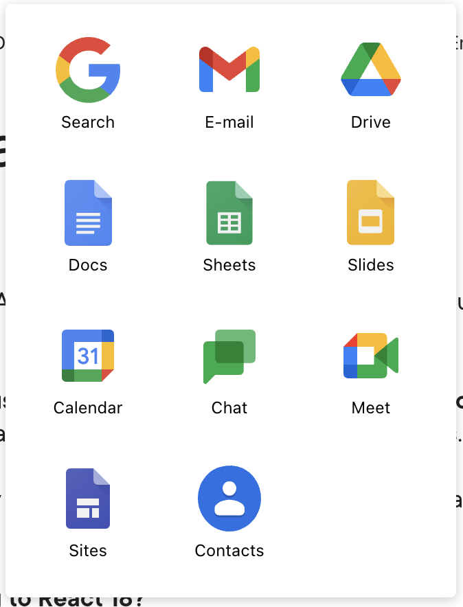
Target that allows adding new bookmarks to the App launcher component
Compatibility
| Target ID | bookmarks-items |
| Description | Target that focuses on the bookmarks items (app launcher) icon on the top bar of your site |
| Placements | Compatible with placements: LEFT, RIGHT. Customizations are added as siblings of the other bookmarks in the launcher |
| Disable | No compatibility, however, bookmarks can be individually disabled |
| Changing text | No compatibility |
Use cases
Community
Target that allows customizing the surroundings of a community page.
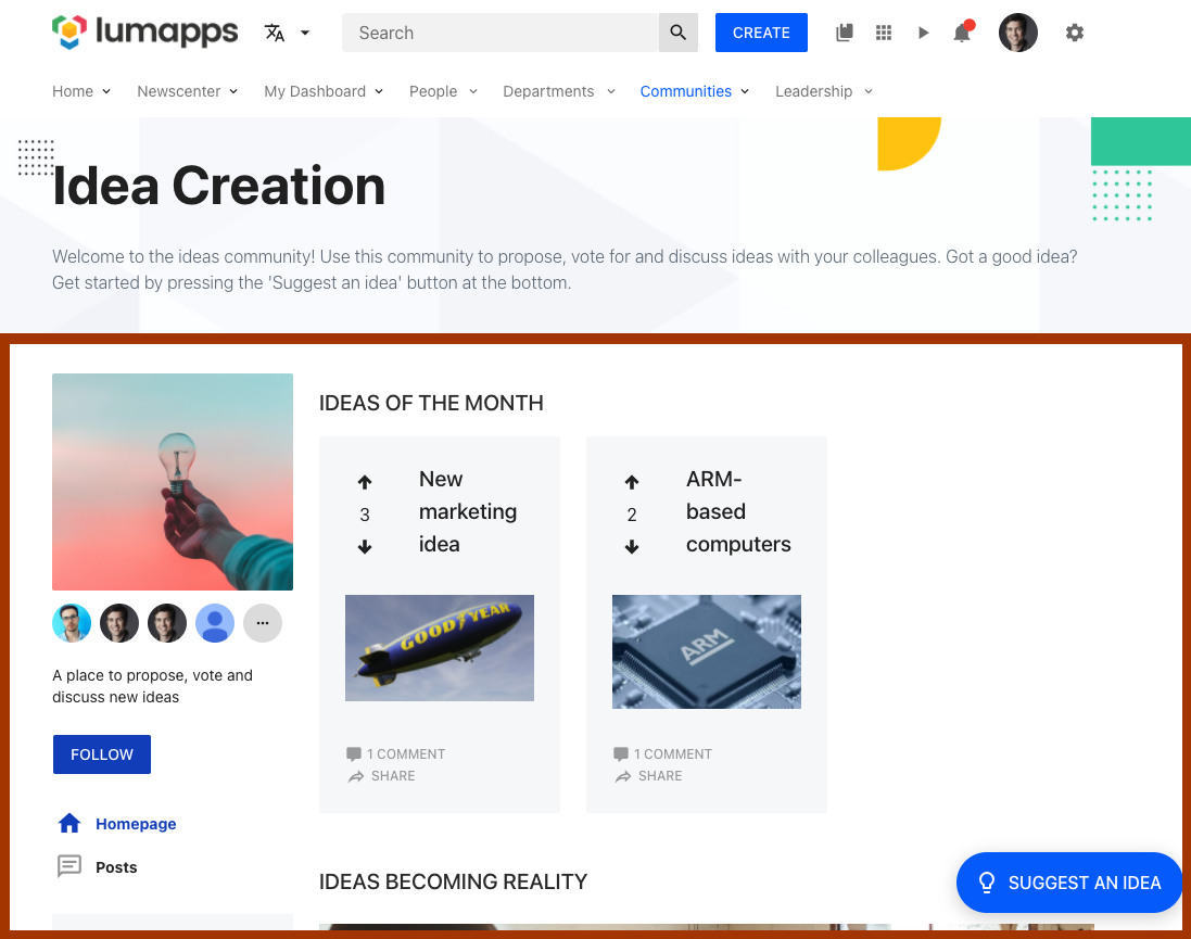
Compatibility
| Target ID | community |
| Description | Target that focuses on the Community page. Adding a customization to this target would mean that ALL communities will display it. |
| Placements | Compatible with placements: ABOVE, UNDER. For ABOVE, the customization will appear between the header of the application and the main section of the community |
| Disable | No compatibility |
| Changing text | No compatibility |
Use cases
Content
Target that allows customizing the surroundings of a Content page.
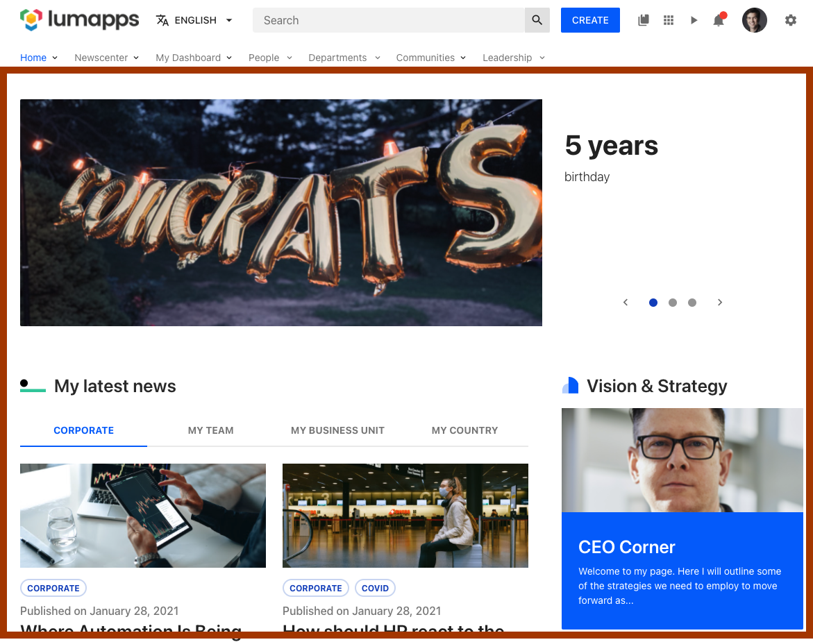
Compatibility
| Target ID | content |
| Description | Target that focuses on the Content page. Adding a customization to this target would mean that ALL contents will display it. |
| Placements | Compatible with placements: ABOVE, UNDER. For ABOVE, the customization will appear between the header of the application and the main section of the content |
| Disable | No compatibility |
| Changing text | No compatibility |
Use cases
Contextual actions
Target that allows customizing the surroundings of the contextual actions displayed on content pages.

Compatibility
| Target ID | contextual-actions |
| Description | Target that focuses on the Contextual actions, adding new custom actions. |
| Placements | Compatible with placements: ABOVE, UNDER. Custom actions will be added as siblings of the out-of-the-box-actions |
| Disable | No compatibility |
| Changing text | No compatibility |
Use cases
Contribution button
Target that allows customizing the contribution button located on the top bar of your site.

Compatibility
| Target ID | contribution-button |
| Description | Target that focuses on the Contribution button on the top bar. |
| Placements | Compatible with placements: LEFT, RIGHT. Customizations are added as siblings of the contribution button. |
| Disable | Can be disabled. Disabling this feature will make the button hidden for all users |
| Changing text | No compatibility |
Use cases
Contribution menu
Target that allows customizing the contribution menu displayed once the contribution button has been clicked.
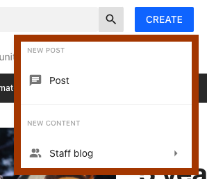
Compatibility
| Target ID | contribution-menu |
| Description | Target that focuses on the Contribution Menu displayed from the contribution button. |
| Placements | Compatible with placements: ABOVE, UNDER. Customizations are added as siblings of the other actions in the menu |
| Disable | No compatibility |
| Changing text | No compatibility |
Use cases
Directory
Target that allows customizing the directory page.
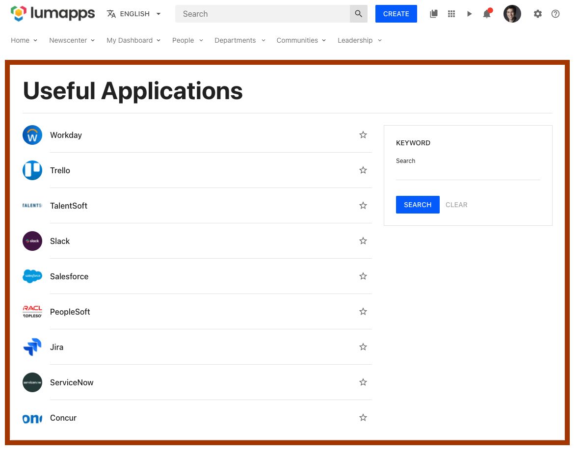
Compatibility
| Target ID | directory |
| Description | Target that focuses on the Directory page. |
| Placements | Compatible with placements: ABOVE, UNDER. |
| Disable | No compatibility |
| Changing text | No compatibility |
Use cases
Error page
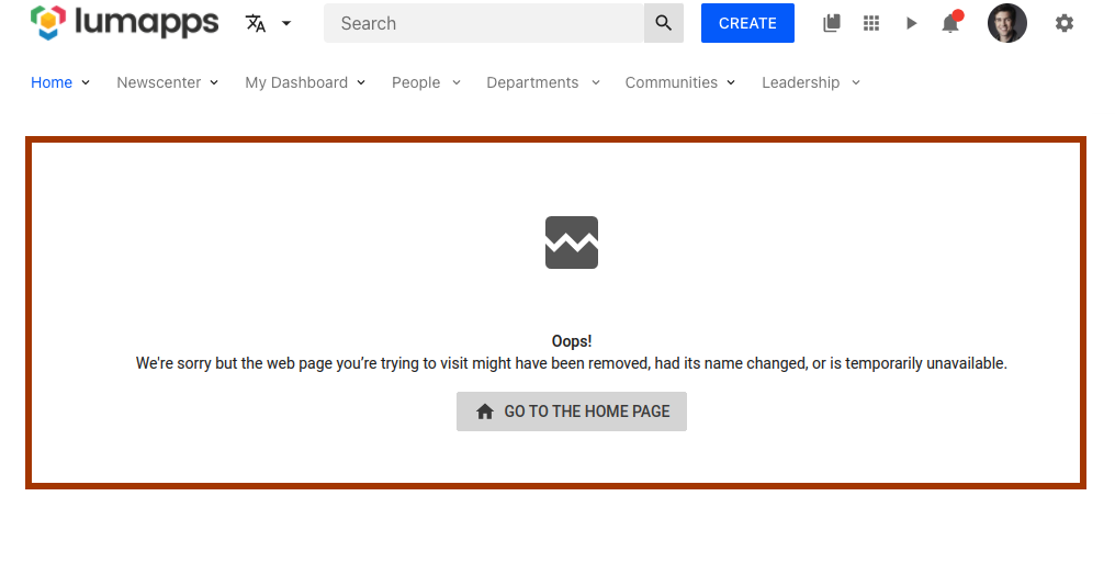
Target that allows customizing the error pages.
Compatibility
| Target ID | error-page |
| Description | Target for the error pages (all but 404) of your site. |
| Placements | Compatible with placements: REPLACE. |
| Disable | No compatibility |
| Changing text | No compatibility |
Note: Using context it is possible to retrieve the redirectButtonProps which includes href, emphasis and translated label, allowing to reuse the default redirect button (if any) of each error page.
Favorites
Target that allows customizing the favorites directories displayed on the top bar.

Compatibility
| Target ID | favorites |
| Description | Target for the favorites directories displayed at the top bar. |
| Placements | No compatibility |
| Disable | Can be disabled. Disabling this features hides ALL directories flagged as “Manage favorites”. |
| Changing text | No compatibility |
Feed
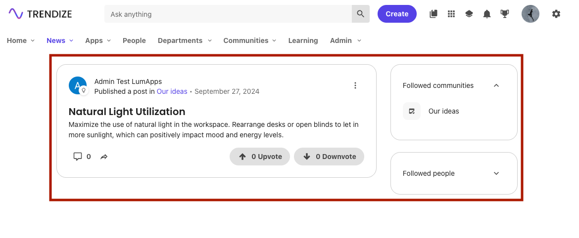
Target that allows customizing the feed page.
Compatibility
| Target ID | feed |
| Description | Target that focuses on the Feed page. |
| Placements | Compatible with placements: ABOVE, UNDER. |
| Disable | No compatibility |
| Changing text | No compatibility |
Use cases
Header
Target that allows customizing the entire header of the application, which englobes the top bar (logo, search box, notifications), the navigation of the site as well as the site’s slideshow.

Compatibility
| Target ID | header |
| Description | Target for the header of your site. |
| Placements | No compatibility |
| Disable | No compatibility |
| Changing text | No compatibility |
Logo
Target that allows customizing the surroundings of the site’s logo.
Compatibility
| Target ID | logo |
| Description | Target for the logo of your site. |
| Placements | Compatible with placements: LEFT, RIGHT. Customizations will be added as siblings of the Logo |
| Disable | No compatibility |
| Changing text | No compatibility |
Use cases
Navigation
Target that allows customizing the main navigation of your site, which is the first navigation displayed on your top bar.

Compatibility
There are two targets that focus on the main navigation, each of them have a different end result.
| Target ID | navigation |
| Description | Target for the entire main navigation feature of your site. |
| Placements | Compatible with placements: LEFT, RIGHT (customizations will be added as siblings of the other navigation items displayed) and ABOVE, UNDER ( Customizations will be added as siblings of the navigation itself) |
| Disable | Can be disabled**. |
| Changing text | No compatibility |
Note:: Disabling this feature prevents the navigation from being displayed on the site, removing the entire section from your page and avoiding any XHR requests to retrieve the data. Some additional CSS is needed in order to make this customization work as expected
| Target ID | navigation-ui |
| Description | Target for your site’s main navigation interface. |
| Placements | No compatibility |
| Disable | Can be disabled** |
| Changing text | No compatibility |
Note: Disabling this feature prevents the navigation from being displayed on the site, removing the entire section from your page, BUT the navigation is still fetched so it can be reused for rendering a custom navigation. Some additional CSS is needed in order to make this customization work as expected
Use cases
Not found page
Target that allows customizing the not found page (404 error code).

Compatibility
| Target ID | not-found-page |
| Description | Target for the not found pages (404) of your site. |
| Placements | Compatible with placements: REPLACE. |
| Disable | No compatibility |
| Changing text | No compatibility |
Note: Using context it is possible to retrieve the redirectButtonProps which includes href, emphasis and translated label, allowing to reuse the default redirect button (if any) of each error page.
Use cases
Notifications button
Targets that allows customizing the notifications center button

Compatibility
| Target ID | notifications-button |
| Description | Target for the notifications button located on the top bar. |
| Placements | Compatible with placements: LEFT, RIGHT. Customizations will be added as siblings of the notifications button |
| Disable | No compatibility |
| Changing text | No compatibility |
Use cases
Organization chart
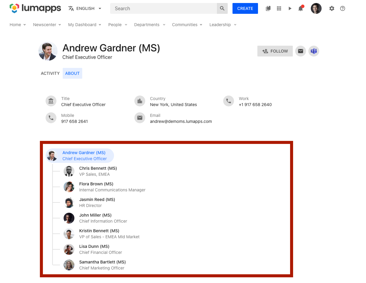
Target that allows customizing the user organization chart.
Compatibility
| Target ID | user-profile-org-chart |
| Description | Target the organization chart section of a user’s profile. |
| Placements | Compatible with placements: ABOVE, UNDER. Customizations will be added as siblings of the displayed user’s organization chart. |
| Disable | No compatibility |
| Changing text | No compatibility |
Notes:
- The
User spacefeature flag must be enabled in order to access the new user profile experience. - The displayed user’s data can be retrieved using context.
Page
Target that allows customizing pages on your site. This specific target allows developers to display a customization on all pages no matter whether they are the search page, the user profile page or more dynamic pages like content pages and community pages.
Compatibility
| Target ID | page |
| Description | Target all pages of your site. |
| Placements | Compatible with placements: ABOVE, UNDER. Customizations will be added as siblings of the current page*. |
| Disable | No compatibility |
| Changing text | No compatibility |
Note: If there is another customization in place that targets more specific targets like Content or Community, the page customization is displayed above and below these customizations.
Use cases
Playlist
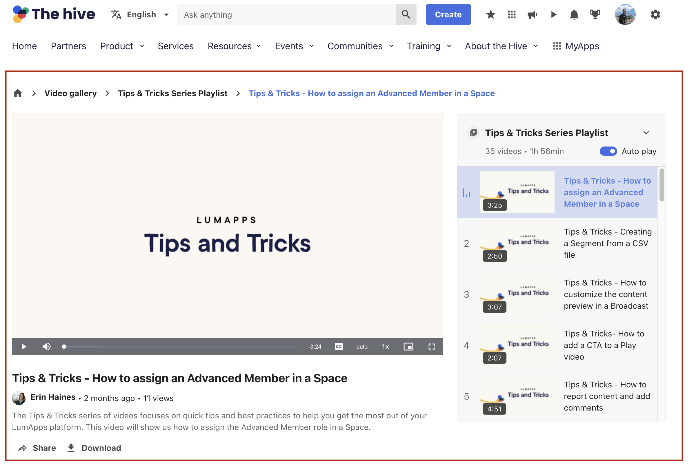
Target that allows customizing the playlist page.
Compatibility
| Target ID | playlist |
| Description | Target that focuses on the Playlist page. |
| Placements | Compatible with placements: ABOVE, UNDER. |
| Disable | No compatibility |
| Changing text | No compatibility |
Use cases
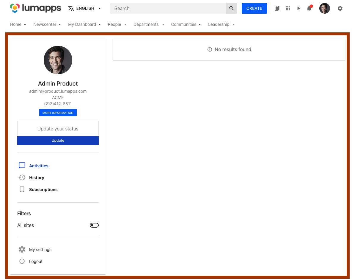
Profile
Target that allows customizing a user’s profile page.
Compatibility
| Target ID | profile |
| Description | Target the user profile page. |
| Placements | Compatible with placements: ABOVE, UNDER. Customizations will be added as siblings of the user profile page. |
| Disable | No compatibility |
| Changing text | No compatibility |
Use cases
Search
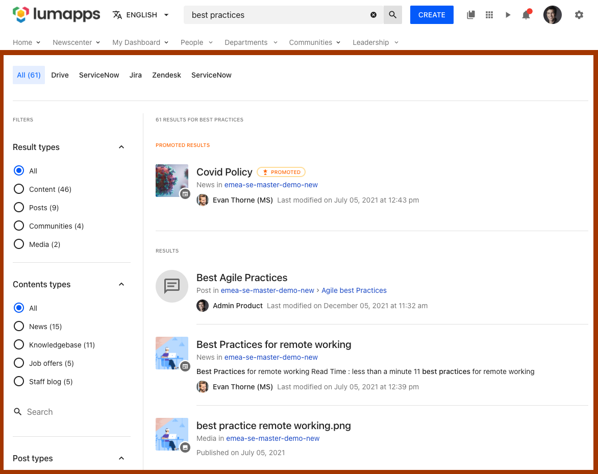
Target that allows customizing the search page.
Compatibility
| Target ID | search |
| Description | Target the search page. |
| Placements | Compatible with placements: ABOVE, UNDER. Customizations will be added as siblings of the search page. |
| Disable | No compatibility |
| Changing text | No compatibility |
Use cases
Search box
Target that allows customizing the search box located at the top bar.

Compatibility
| Target ID | search-box |
| Description | Target the search box at the top bar. |
| Placements | Compatible with placements: LEFT, RIGHT. Customizations will be added as siblings of the search box. |
| Disable | Can be disabled. Disabling this component hides the search box and all features related to search. |
| Changing text | Can be changed. The text displayed on the search box placeholder can be changed by using the change text functionality. |
Use cases
Search custom metadata
Target that allows customizing the search custom metadata.
Compatibility
| Target ID | search-custom-metadata |
| Description | Target the search custom metadata. |
| Placements | No compatibility |
| Disable | No compatibility. |
| Changing text | No compatibility. |
Search extension result
Target that allows replacing search results coming from any search extension.

Compatibility
| Target ID | search-extension-result |
| Description | Target the search extension result. |
| Placements | Compatible with placements: REPLACE. |
| Disable | No compatibility. |
| Changing text | No compatibility. |
Note: Using context it is possible to retrieve the full data of the search result. This, combined with RawHTML component, allows a full customization of the extension search result.
Search result icon
Target that allows customizing icons of the search results of both the search page and quick search.
![]()
![]()
Compatibility
| Target ID | search-result-icon |
| Description | Target the search result icon. |
| Placements | Compatible with placements: REPLACE. |
| Disable | No compatibility. |
| Changing text | No compatibility. |
Note: Using context it is possible to retrieve data of the search result being customized as well as its type. This allows specific customization depending on result type / data etc… In addition, a SearchThumbnail component is available to be as close as possible to the current implementation.
Use cases
- Replace icons for a specific result type
- Replace icons with a custom svg
- Replace icons of documents with a specific mimetype
- Replace icons of documents with a specific source id
Search tab
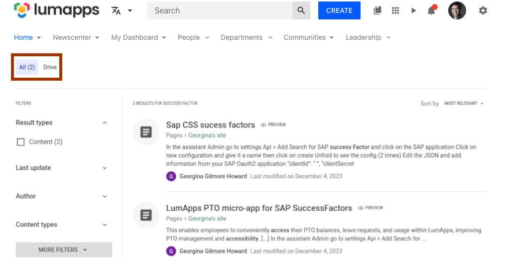
Target that allows customizing the search tab.
Compatibility
| Target ID | search-tab |
| Description | Target the search tab. |
| Placements | Compatible with placements: LEFT |
| Disable | No compatibility. |
| Changing text | No compatibility. |
Note: Using context it is possible to retrieve the id of each tab displayed in the search result page.
Use cases
Settings button
Target that allows customizing the settings icon displayed on the top bar.

Compatibility
| Target ID | settings-button |
| Description | Target the settings icon on the top bar. |
| Placements | Compatible with placements: LEFT, RIGHT. Customizations will be added as siblings of the settings icon. |
| Disable | No compatibility |
| Changing text | No compatibility |
Use cases
Settings
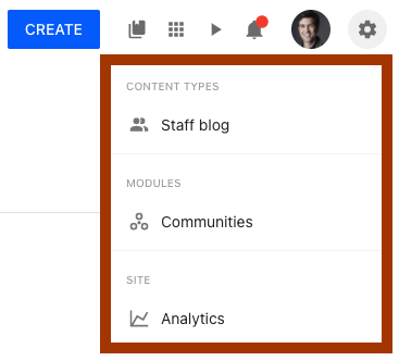
Target that allows customizing the settings links displayed on the dropdown triggered by the settings button.
Compatibility
| Target ID | settings |
| Description | Target the settings dropdown. |
| Placements | Compatible with placements: ABOVE, UNDER. |
| Disable | No compatibility |
| Changing text | No compatibility |
Note: Customizations added to this target will only be visible to those users that have access to one of the multiple settings displayed on the dropdown. If a user does not have access to this icon, the customizations will not be displayed
Use cases
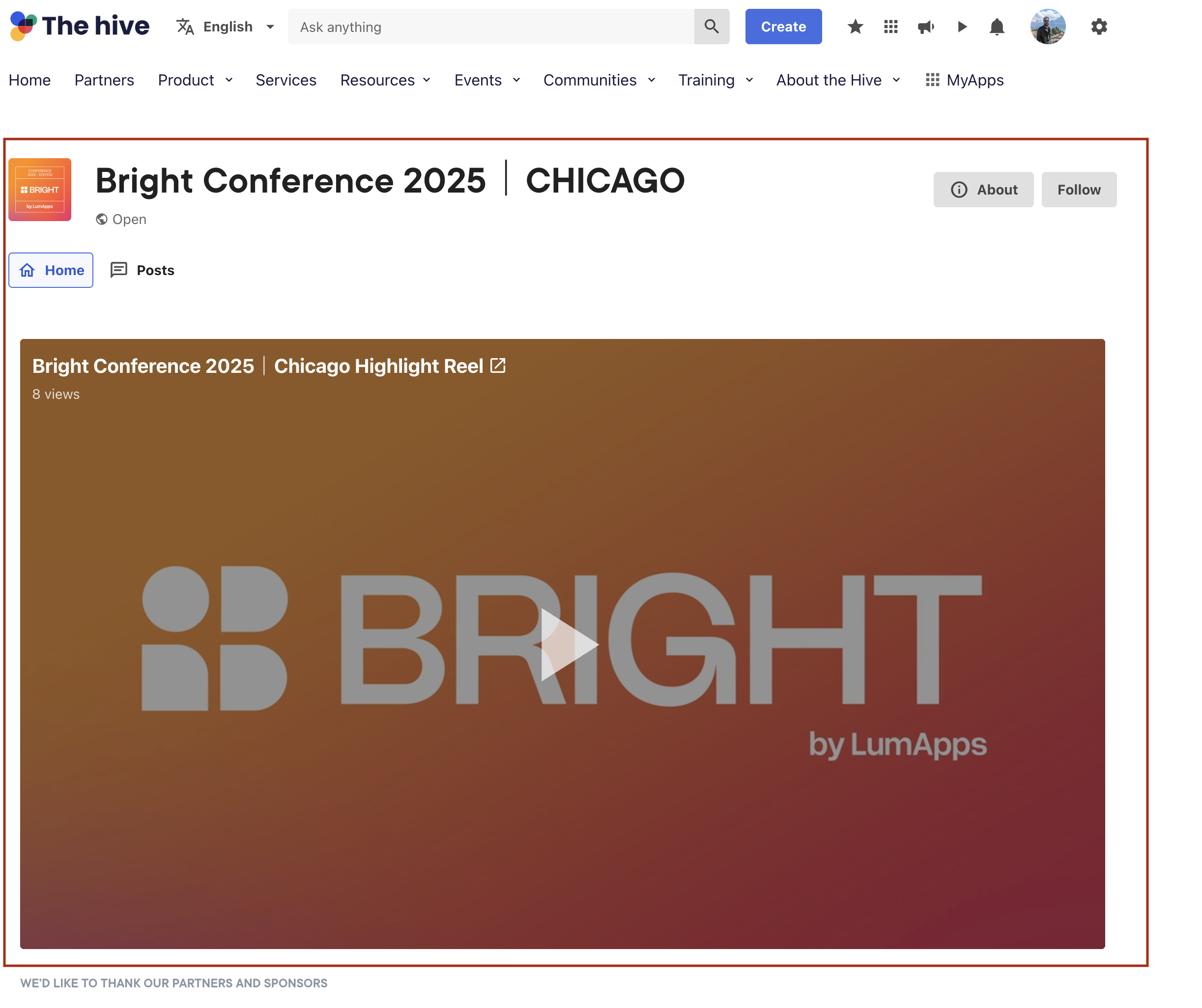
Space
Target that allows customizing the space page.
Compatibility
| Target ID | space |
| Description | Target that focuses on the Space page. |
| Placements | Compatible with placements: ABOVE, UNDER. |
| Disable | No compatibility |
| Changing text | No compatibility |
Use cases
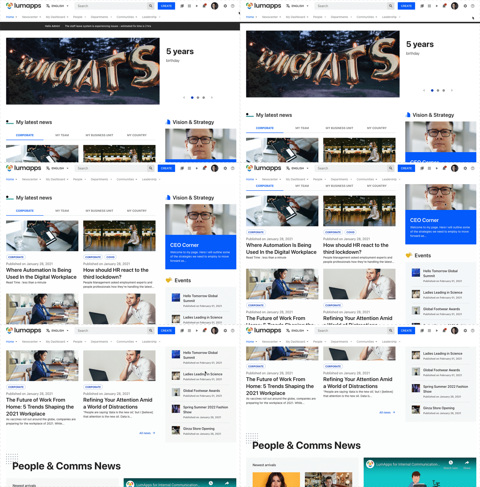
Sticky header
Target that allows deactivating that your site’s header has a sticky behaviour, meaning that it will stick to the top of your page while the user is scrolling.
Compatibility
| Target ID | sticky-header |
| Description | Target that allows disabling the sticky header * |
| Placements | No compatibility |
| Disable | Can be disabled. * |
| Changing text | No compatibility |
Note: some extra CSS needs to be added in order to make this customization have the expected result
Use cases
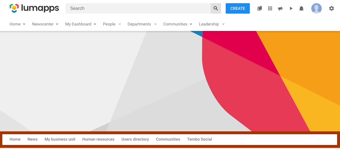
Sub Navigation
Target that allows customizing the sub navigation of your site, which is the second navigation displayed on your top bar when your site has a parent site and the navigation inheritance feature is activated
Compatibility
There are two targets that focus on the sub navigation, each of them have a different end result.
| Target ID | sub-navigation |
| Description | Target for the entire sub navigation feature of your site *. |
| Placements | Compatible with placements: LEFT, RIGHT (customizations will be added as siblings of the other navigation items displayed) and ABOVE, UNDER ( customizations will be added as siblings of the navigation itself) |
| Disable | Can be disabled. |
| Changing text | No compatibility |
Note: Disabling this feature prevents the navigation from being displayed on the site, removing the entire section from your page and avoiding any XHR requests to retrieve the data. Some additional CSS is needed in order to make this customization work as expected
| Target ID | sub-navigation-ui |
| Description | Target for your site’s sub navigation interface. |
| Placements | No compatibility |
| Disable | Can be disabled. * |
| Changing text | No compatibility |
Note: Disabling this feature prevents the navigation from being displayed on the site, removing the entire section from your page, BUT the navigation is still fetched so it can be reused for rendering a custom navigation. Some additional CSS is needed in order to make this customization work as expected
Use cases
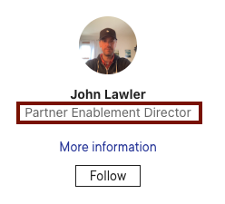
User card fields
Target that allows customizing a user’s card fields section, adding additional fields below the current existing ones.
Compatibility
| Target ID | user-card-fields |
| Description | Target the user card fields. |
| Placements | Compatible with placements: UNDER. |
| Disable | No compatibility |
| Changing text | No compatibility |
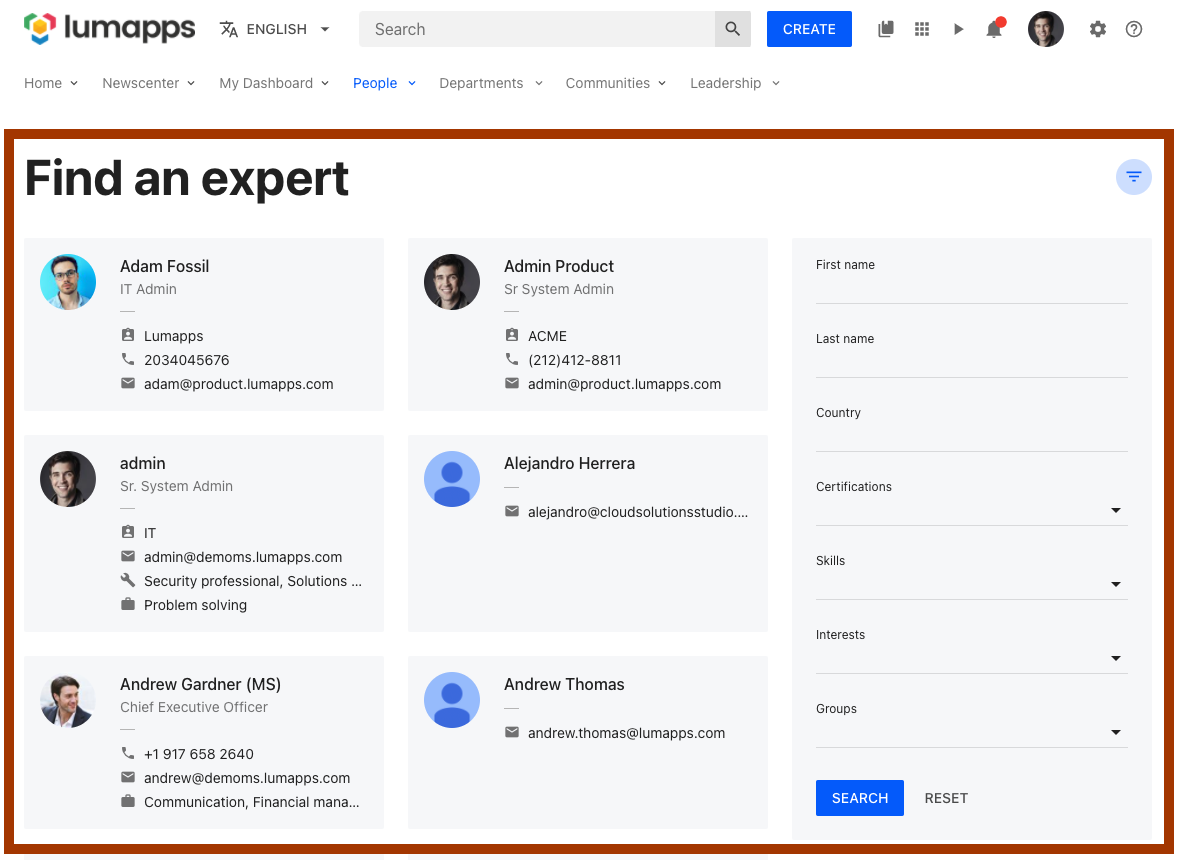
User Directory
Target that allows customizing the user directory page.
Compatibility
| Target ID | user-directory |
| Description | Target that focuses on the User Directory page. |
| Placements | Compatible with placements: ABOVE, UNDER. |
| Disable | No compatibility |
| Changing text | No compatibility |
Use cases
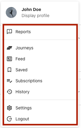
User Dropdown Links
Target that allows customizing the user dropdown links section on the top bar
Compatibility
| Target ID | user-dropdown-links |
| Description | Target for the user dropdown menu links displayed on the top bar |
| Placements | Compatible with placements: ABOVE, UNDER. Customizations will be added as siblings of the other elements. |
| Disable | No compatibility. |
| Changing text | No compatibility. |
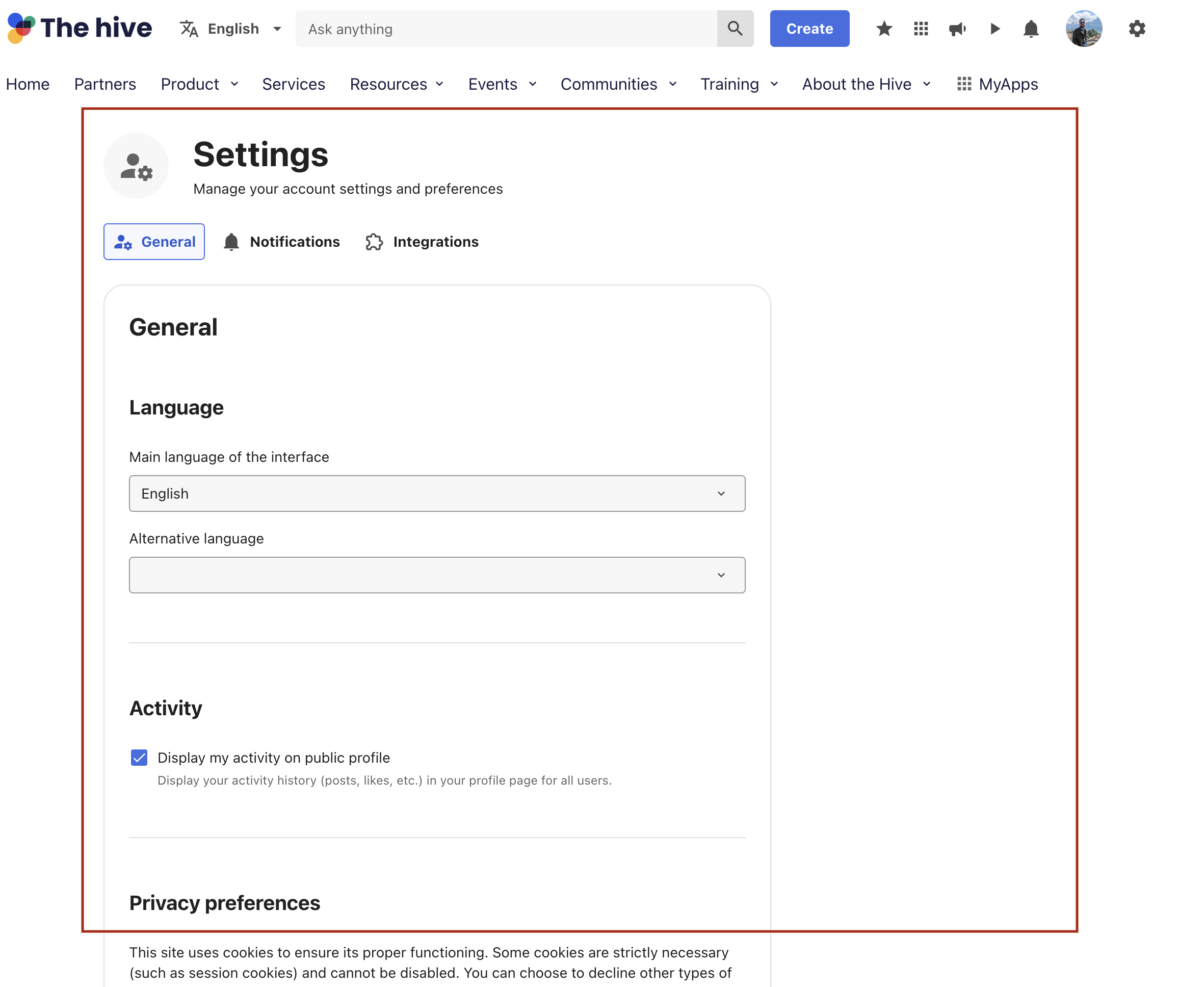
User Settings
Target that allows customizing the user settings page.
Compatibility
| Target ID | user-settings |
| Description | Target that focuses on the User settings page. |
| Placements | Compatible with placements: ABOVE, UNDER. |
| Disable | No compatibility |
| Changing text | No compatibility |
Use cases
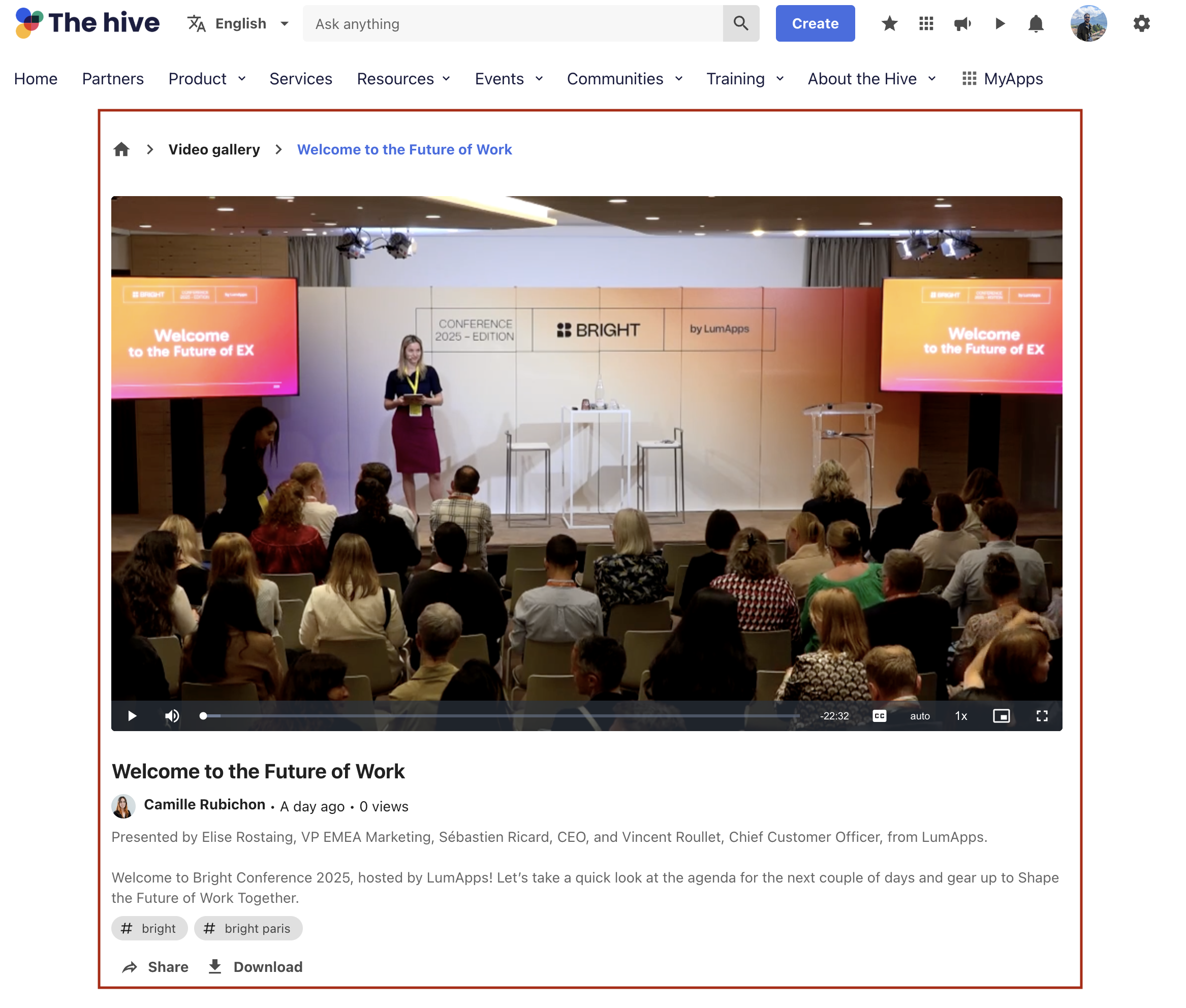
Video
Target that allows customizing the video page.
Compatibility
| Target ID | video |
| Description | Target that focuses on the Video page. |
| Placements | Compatible with placements: ABOVE, UNDER. |
| Disable | No compatibility |
| Changing text | No compatibility |
Use cases
Widget
Dynamic target that allows customizing the surroundings of a widget in the Next Gen Interface.
IMPORTANT:
- This is only compatible with pages rendered in the Next Gen Interface.
- This target should only be used for customizing an existing widget. For creating new custom widgets, please create an extension
Compatibility
| Target ID | widget-{<id>} * |
| Description | Dynamic target that allows customizing the surroundings of a [widget] |
| Placements | Compatible with placements: ABOVE, UNDER ** |
| Disable | No compatibility |
| Changing text | No compatibility |
Notes:
idcan be retrieved by inspecting the HTML of your content and retrieving the id. Without theid, the target will be considered as invalididcan also be theidentifierthat can be added from the widget’s c

- Additional CSS might be needed, depending on the nature of your customization and the layout of your content page
Use cases
Widget - Legacy Interface
Dynamic target that allows customizing the surroundings of a widget in the Legacy Interface
IMPORTANT:
- This is only compatible with pages rendered in the Legacy interface.
- This is only compatible with HTML widgets
- This target should only be used for customizing an existing widget. For creating new custom widgets, please create an extension
Compatibility
| Target ID | widget-{<id>} * |
| Description | Dynamic target that allows customizing the surroundings of a [widget] |
| Placements | Compatible with placements: ABOVE, UNDER ** |
| Disable | No compatibility |
| Changing text | No compatibility |
Notes:
idcan be retrieved by inspecting the HTML of your widget and retrieving the id from the surrounding container of the widget. Without theid, the target will be considered as invalid
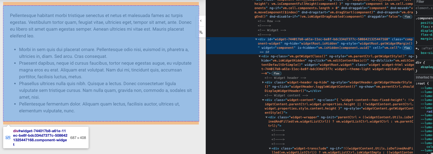
- Additional CSS might be needed, depending on the nature of your customization and the layout of your content page
Use cases
Listening to events
The Customizations API allows, among other things, developers to listen predefined events on several sections of their sites. One of the goals of this API is to expose set of props based on user actions that can be easily used for instance for component customization in order to render additional components in some specific cases while reusing the Customization API render function.
In order to understand the possibilities that we have with this API, we need to first define the different elements that compose a Event. These components are:
-
Event: This is the event that we want to use as reference for our customization. It is to be noted that there is a predefined list of events that are marked as events.
-
Callback: This is where props from a given event can be retrieved. Each events has its own set of props that can be used for rendering a custom components based on props values or send tracking events to collect data on users actions. Using this capabilities it becomes possible to have one component communicating with another one.
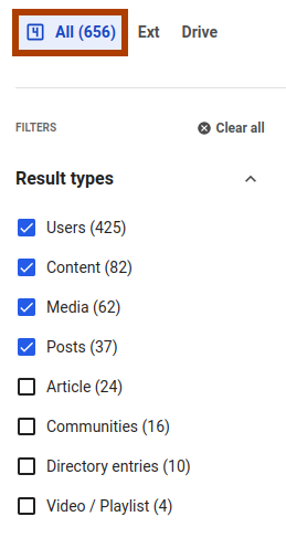
As an example, inserting the following code in your LumApps site will display an icon in the search tab based on the number of result type filters selected:
on(events.SEARCH, (props) => {
    const resultTypeFilter = props.filters.find((f) => f.id === '_metadata.type');
    const tabs = [
        {
            uid: 'all',
            icon: `numeric-${
                resultTypeFilter === undefined || resultTypeFilter.value === undefined
                    ? 0
                    : resultTypeFilter.value.length
            }-box-outline`,
        },
    ];
    render({
        placement: placement.LEFT,
        target: targets.SEARCH_TAB,
        toRenderWithContext: (id) => {
            const tabToFormat = tabs.find((tab) => tab.uid === id);
            if (tabToFormat === undefined) return;
            return Icon({
                icon: tabToFormat.icon,
                className: 'search-filters-tab__custom-tab-icon',
            });
        },
    });
});
