API
The main entrypoint of this API is the object window.lumapps. On this object, the following functions are available:
- customize
- setText
- disable
- getCurrentContent
- getInternalUrl
- displayNotification
- addWidgetFilters
- addSearchFilters
customize
window.lumapps.customize(callback, configuration)
Where callback is a function that will receive a set of parameters and returns void. These are the parameters that the callback function expects:
| Parameter | Description |
|---|---|
targets | The different targets that can be customized on your site. |
placement | The different placements that can be used for positioning components on your site. |
components | A group of components that can be used for customizing your site. |
constants | A group of variables that hold the different constants that can be used for creating components on your site. |
render | Function that allows rendering a component in a specific placement and target. See more details for this function here. |
session | Object that contains several values from the current session that can be useful when creating customizatio ns. See more details for this function here |
on | Function that will be executed upon user actions or component rendering. See more details for this function here |
pushEvent | Function that generates custom events. See more details for this function here |
getLatestEvents | Function that retrieves the latest events generated on the application. See more details for this function here |
state | Object that provides state management capabilities. See more details for this function here |
addWidgetFilters | Function that allows adding custom filters to widgets. Supports public site customizations when configured. See more details here |
addSearchFilters | Function that allows adding custom filters to global search and Ask AI. Supports public site customizations when configured. See more details here |
onNavigation (deprecated) | Function that will be executed once any widget in a content is rendered. See more details for this function here |
onWidgetRendered (deprecated) | Function that will be executed once the application has performed a navigation. See more details for this function here |
api | Axios instance that allows the developer to execute AJAX requests. See more details for this function here |
And configuration is an object that allows these properties:
| Parameter | Description |
|---|---|
shouldRenderOnNavigation | Whether the customization callback should be executed upon navigation. If true, the callback will be executed on every navigation that the application executes. IMPORTANT: Please make sure that this option applies and is needed to your use case in order to avoid having an unnecessary performance impact. Normally you would not need to set it to true |
shouldRenderOnPublicSites | Whether the customization should be executed for anonymous (unauthenticated) users on public sites. Default is false. When set to true, the customization will run for both authenticated and unauthenticated users, provided that: 1) The public-js-customizations feature flag is enabled for your organization, and 2) The organization setting “Allow anonymous execution of customizations” is enabled in the Back Office Advanced Settings. IMPORTANT: This feature is optional and should be used carefully. Refer to the security considerations section before enabling. |
shouldUseCurrentContent | If the customization uses data from the current content (by executing window.lumapps.getCurrentContent()). As of right now, other than that use case, shouldUseCurrentContent should always be false. |
Public Site Customizations Security
When using shouldRenderOnPublicSites: true, customizations will execute for anonymous (unauthenticated) users on public sites. This feature requires careful consideration:
Requirements:
- The
public-js-customizationsfeature flag must be enabled for your organization - The organization setting “Allow anonymous execution of customizations” must be enabled in Back Office > Advanced Settings > Customization
Important Security Considerations:
⚠️ Warning: This feature is optional and you are not required to activate it. Its use is entirely at your own risk. The use of this feature may cause the Application to behave erratically and pose security risks. We strongly recommend that you contact your IT and security departments before activating it. LumApps maintains no oversight or control over this feature’s application.
Best Practices:
- Only enable public site customizations if absolutely necessary for your use case
- Carefully review all customization code that will run on public sites
- Avoid exposing sensitive information in customizations visible to anonymous users
- Test thoroughly on public pages before deploying to production
- Consider the performance impact of customizations on public pages
- Regularly audit your public customizations for security vulnerabilities
Example Usage:
// Customization that only runs for authenticated users (default behavior)
window.lumapps.customize(({ render, targets, placement, components }) => {
    render(targets.HEADER, placement.AFTER, components.Banner({
        text: 'Welcome back!',
    }));
});

// Customization that runs for both authenticated and anonymous users
window.lumapps.customize(({ render, targets, placement, components }) => {
    render(targets.HEADER, placement.AFTER, components.Banner({
        text: 'Welcome to our public site!',
    }));
}, { shouldRenderOnPublicSites: true });
events
events is a key/value object that holds the available events that can be subcribed to on LumApps. This variable allows developers to avoid figuring out which ids to use in order to listen to a specific event, and it also defines the available events that can be used for customization. As of now, these are the values for this object:
| Target | Description | Compatibilities |
|---|---|---|
events.NAVIGATION | Event id for user navigation events. | Documentation |
events.SEARCH | Event id for the user search page interaction events. | Documentation |
events.WIDGET_RENDERED | Event id for the event triggered after rendering a widget. | Documentation |
targets
targets is a key/value object that holds the available targets that can be customized on LumApps. This variable allows developers to avoid figuring out which ids to use in order to customize a specific target, and it also defines the available targets that can be customized. As of now, these are the values for this object:
Specific components
The following table displays the targets for the individual components across LumApps
| Target | Description | Compatibilities |
|---|---|---|
targets.APP | Target id for application | Documentation |
targets.BOOKMARKS | Target id for the bookmarks/app launcher component | Documentation |
targets.BOOKMARKS_ITEMS | Target id for the bookmarks displayed inside the app launcher | Documentation |
targets.CONTRIBUTION_BUTTON | Target id for the contribution button. | Documentation |
targets.CONTRIBUTION_MENU | Target id for the contribution menu. | Documentation |
targets.CONTEXTUAL_ACTIONS | Target id for the contextual actions menu on the right hand side of a content page. | Documentation |
targets.FAVORITES | Target id for the favorite directories. | Documentation |
targets.HEADER | Target id for the site’s header. | Documentation |
targets.LOGO | Target id for the site’s logo. | Documentation |
targets.NAVIGATION | Target id for the main navigation. | Documentation |
targets.NAVIGATION_UI | Target id for the main navigation’s UI. | Documentation |
targets.NOTIFICATIONS_BUTTON | Target id for the notifications center component. | Documentation |
targets.SEARCH_BOX | Target id for the search box. | Documentation |
targets.SEARCH_CUSTOM_METADATA | Target id for search custom metadata. | Documentation |
targets.SEARCH_EXTENSION_RESULT | Target id for result coming from search extensions. For further information, please refer to the search SDK documentation. | Documentation |
targets.SEARCH_RESULT_ICON | Target id for icons of the search result page and quick search. | Documentation |
targets.SEARCH_TAB | Target id for search tab. | Documentation |
targets.SETTINGS | Target id for the settings menu. | Documentation |
targets.SETTINGS_BUTTON | Target id for the settings icon on the top bar. | Documentation |
targets.STICKY_HEADER | Target id for the sticky header. | Documentation |
targets.SUB_NAVIGATION | Target id for the sub navigation. | Documentation |
targets.SUB_NAVIGATION_UI | Target id for the sub navigation’s UI. | Documentation |
targets.USER_CARD_FIELDS | Target id for the user card displayed on hovering users | Documentation |
targets.USER_DROPDOWN_LINKS | Target id for the user dropdown links page. | Documentation |
targets.USER_PROFILE_HEADER_FIELDS | Target id for the user profile header fields | Documentation |
targets.USER_PROFILE_ORG_CHART | Target id for the user profile organization chart | Documentation |
targets.WIDGET | Target id for a widget. | Documentation |
Pages
The following table displays the targets for LumApps pages | Target | Description | Compatibilities | |————————————–|————————————————————————————-|————————————————————-| | targets.COMMUNITY | Target id for the community pages | Documentation | | targets.CONTENT | Target id for the content page | Documentation | | targets.CUSTOM_LIST | Target id for the custom list page. | Documentation | | targets.DIRECTORY | Target id for the directory. | Documentation | | targets.ERROR_PAGE | Target id for the error pages. | Documentation | | targets.FEED | Target id for the feed page. | Documentation | | targets.NOT_FOUND_PAGE | Target id for the not found error page (error code 404). | Documentation | | targets.PAGE | Target id for all pages. | Documentation | | targets.PLAYLIST | Target id for the playlist page. | Documentation | | targets.PROFILE | Target id for the profile page. | Documentation | | targets.SEARCH | Target id for the search page. | Documentation | | targets.SPACE | Target id for the space page. | Documentation | | targets.USER_DIRECTORY | Target id for the user directory. | Documentation | | targets.USER_SETTINGS | Target id for the user settings page. | Documentation | | targets.VIDEO | Target id for the video page. | Documentation |
widget target
The Widget target needs to be used in combination with a widget id. The final target passed in into the render function should be ${targets.WIDGET}-${widget-id}.
window.lumapps.customize(({ targets, components, render, placement, constants }) => {
    const { Message } = components;
    const { Kind } = constants;

    render({
        placement: placement.ABOVE,
        target: 'widget-2452456502u0596839-468345',
        toRender: Message({
            className: 'widget-message',
            kind: Kind.info,
            children: 'Message above the widget 5251881089236992',
            hasBackground: true,
        }),
    });
});
You can also use the identifier that can be added into the Style configuration on your widget while editing a content as a target for rendering customizations. The final target passed in into the render function should be ${targets.WIDGET}-${identifier}.

window.lumapps.customize(({ targets, components, render, placement, constants }) => {
    const { Message } = components;
    const { Kind } = constants;

    render({
        placement: placement.ABOVE,
        target: 'widget-estimate-reading-time',
        toRender: Message({
            className: 'widget-message',
            kind: Kind.info,
            children: 'Message above the widget estimate-reading-time',
            hasBackground: true,
        }),
    });
});
placements
placement is a key/value object that holds the available placements that can be used for customizing LumApps.
This variable allows developers to avoid figuring out which ids to use in order to customize a specific target, and it also defines the available palcements that can be customized. As of now, these are the values for this object:
| Placement | Description |
|---|---|
placement.ABOVE | Places the customized component at the top of the target. |
placement.UNDER | Places the customized component at the bottom of the target. |
placement.LEFT | Places the customized component at the left of the target. |
placement.RIGHT | Places the customized component at the right of the target. |
placement.REPLACE | Replaces the target for the customized component. |
Note: not all placements are compatible with every single target. Please take a look at this compatibility in the capabilities documentation.
components
Avatar
window.lumapps.customize(({ components, constants }) => {
    const { Avatar } = components;
    const { Size } = constants;

    const component = Avatar({
        image: 'https://url.to.image.com',
        size: Size.s,
        className: 'avatar-custom-css-class'
    });
})
Avatar options:
| Option | Description | Is required? | Option type | Default Value |
|---|---|---|---|---|
image | Url of the image to be used when rendering the avatar | Yes | string | undefined |
size | Size of the avatar. | No | Size | Size.m |
className | CSS class that will be applied directly into the wrapper container. | No | string or css classes | undefined |
Badge
window.lumapps.customize(({ components, constants }) => {
    const { Badge } = components;
    const { ColorPalette } = constants;

    const component = Badge({
        color: ColorPalette.red,
        className: 'badge-custom-css-class',
        children: '4'
    });
})
Badge options:
| Option | Description | Is required? | Option type | Default Value |
|---|---|---|---|---|
children | String that will be displayed as the content of the badge. | Yes | string | undefined |
size | Size of the avatar. | No | Size | Size.m |
className | CSS class that will be applied directly into the wrapper container. | No | string or css classes | undefined |
Bookmark

window.lumapps.customize(({ components, constants }) => {
    const { Bookmark } = components;

    const component = Bookmark({
        title: 'Test',
        link: 'https://google.com',
        icon: 'https://link-to-image.com',
    });
})
Bookmark options:
| Option | Description | Is required? | Option type | Default Value |
|---|---|---|---|---|
title | Bookmark title to display. | Yes | string | undefined |
link | Bookmark link to display. | No | string | undefined |
icon | Bookmark icon to display, should be a URL | Yes | string | undefined |
Button

window.lumapps.customize(({ components, constants }) => {
    const { Button } = components;
    const { Size, ColorPalette, Emphasis } = constants;

    const onClick = () => {
        console.log('on button click!')
    };

    const component = Button({
        children: 'Help',
        className: 'button-custom-css-class',
        leftIcon: 'help',
        onClick,
        emphasis: Emphasis.low,
    });
})
Button options:
| Option | Description | Is required? | Option type | Default Value |
|---|---|---|---|---|
children | String that will be displayed as the content of the button. | Yes | string | undefined |
aria-label | Aria label to be displayed on the rendered button. | Yes | string | undefined |
size | Size of the button. | No | Size | Size.m |
className | CSS class that will be applied directly into the wrapper container. | No | string or css classes | undefined |
color | Color to be used for the button component. | No | ColorPalette | ColorPalette.primary |
onClick | The callback to execute when clicking on this item. | No | function | undefined |
emphasis | Emphasis variant. | No | Emphasis | Emphasis.high |
hasBackground | Whether or not the button has a background color. | No | boolean | false |
isDisabled | Whether the component should be displayed in a disabled state or not. | No | boolean | false |
name | Native button name property. | No | string | undefined |
href | Native anchor property. Renders a <button> or an <a> accordingly. | No | string | undefined |
target | To be used in combination with href | No | "_self" or "_blank" or "_parent" or "_top". | undefined |
type | Native button type. | No | string | undefined |
leftIcon | Mdi icon id to be displayed on the left hand side of the button. | No | icon | undefined |
rightIcon | Mdi icon id to be displayed on the right hand side of the button. | No | icon | undefined |
Chip

window.lumapps.customize(({ components, constants }) => {
    const { Chip, Icon } = components;
    const { Size, ColorPalette, Emphasis } = constants;

    const onAfterClick = () => {
        console.log('on after chip click!')
    };

    const onClick = () => {
        console.log('on chip click!')
    };

    const component = Chip({
        className: 'chip-custom-css-class',
        after: Icon({ icon: 'close' }),
        onAfterClick,
        onClick,
        emphasis: Emphasis.low,
        color: ColorPalette.primary,
        children: 'Chip',
    });
})
Chip options:
| Option | Description | Is required? | Option type | Default Value |
|---|---|---|---|---|
children | String that will be displayed as the content of the Chip. | Yes | string | undefined |
size | Size of the component. | No | Size | Size.m |
className | CSS class that will be applied directly into the wrapper container. | No | string or css classes | undefined |
color | Color to be used for the component. | No | ColorPalette | ColorPalette.light |
aria-label | Aria label to be displayed on the rendered button. | Yes | string | undefined |
onClick | The callback to execute when clicking on this item. | No | function | undefined |
emphasis | Emphasis variant. | No | Emphasis | Emphasis.high |
hasBackground | Whether or not the button has a background color. | No | boolean | false |
after | Component that will be rendered inside the component but after children. | No | Component | undefined |
before | Component that will be rendered inside the component but before children. | No | Component | undefined |
isDisabled | Whether the component should be displayed in a disabled state or not. | No | boolean | false |
isHighlighted | Whether the component should be displayed in a highlighted state or not. | No | boolean | false |
ContextualAction

window.lumapps.customize(({ targets, components, render, placement, constants }) => {
    const { ContextualAction } = components;
    /**
     * This retrieves the current displayed content, so it can be used as input for creating the customization.
     */
    const currentContent = window.lumapps.getCurrentContent();

    render({
        placement: placement.UNDER,
        target: targets.CONTEXTUAL_ACTIONS,
        toRender: ContextualAction({
            /** The action label. */
            labelKey: 'Action',
            /** The action icon to display in the contextual menu. */
            icon: 'content-copy',
            /** Whether or not the action is disabled. */
            isDisabled: false,
            /** Whether the action should appear selected or not. */
            isSelected: false,
            /** The action tooltip. */
            tooltipLabelKey: 'Do something',
            /** Since we are displaying a link and not a clickable action, we pass link properties to the `action` property in order to configure our link */
            action: {
                href: `https://external.url.com/content/${currentContent.id}`,
                target: '_blank',
            },
        }),
    });
});
ContextualAction options:
| Option | Description | Is required? | Option type | Default Value |
|---|---|---|---|---|
labelKey | The action label. | Yes | string | undefined |
icon | Mdi icon id to be displayed on the left hand side of the button. | Yes | icon | undefined |
action | Object or function that will determine what the action does. | Yes | function () => void; | undefined |
action.href | URL where the user will be redirected if they click on the action | Yes | string | undefined |
action.target | URL target | No | "_self" or "_blank" or "_parent" or "_top". | undefined |
isDisabled | Whether the component should be displayed in a disabled state or not. | No | boolean | false |
isSelected | Whether the action should appear selected or not. | No | boolean | false |
tooltipLabelKey | The action tooltip. | No | string | undefined |
IconButton
window.lumapps.customize(({ components, constants }) => {
    const { Button } = components;
    const { Size, ColorPalette, Emphasis } = constants;

    const onClick = () => {
        console.log('on icon button click!')
    };

    const component = IconButton({
        className: 'icon-button-custom-css-class',
        icon: 'help',
        onClick,
        emphasis: Emphasis.low,
        color: ColorPalette.primary,
    });
})
IconButton options:
| Option | Description | Is required? | Option type | Default Value |
|---|---|---|---|---|
icon | Mdi icon id to be displayed. | Yes | icon | undefined |
aria-label | Aria label to be displayed on the rendered button. | Yes | string | undefined |
size | Size of the component. | No | Size | Size.m |
className | CSS class that will be applied directly into the wrapper container. | No | string or css classes | undefined |
color | Color to be used for the button component. | No | ColorPalette | ColorPalette.primary |
onClick | The callback to execute when clicking on this item. | No | function | undefined |
emphasis | Emphasis variant. | No | Emphasis | Emphasis.high |
hasBackground | Whether or not the button has a background color. | No | boolean | false |
isDisabled | Whether the component should be displayed in a disabled state or not. | No | boolean | false |
name | Native button name property. | No | string | undefined |
href | Native anchor property. Renders a <button> or an <a> accordingly. | No | string | undefined |
target | To be used in combination with href | No | "_self" or "_blank" or "_parent" or "_top". | undefined |
type | Native button type. | No | string | undefined |
Icon
window.lumapps.customize(({ components, constants }) => {
    const { Icon } = components;
    const { Size, ColorPalette } = constants;

    const component = Icon({
        className: 'icon-custom-css-class',
        icon: 'help',
        color: ColorPalette.primary,
        hasShape: true,
    });
})
Icon options:
| Option | Description | Is required? | Option type | Default Value |
|---|---|---|---|---|
icon | Mdi icon id to be displayed. | Yes | icon | undefined |
size | Size of the component. | No | Size | Size.m |
className | CSS class that will be applied directly into the wrapper container. | No | string or css classes | undefined |
color | Color to be used for the button component. | No | ColorPalette | ColorPalette.primary |
hasShape | Boolean that represents whether or not the button has a round shape around it or not. | No | boolean | false |
FlexBox
The FlexBox component is a helper component that allows displaying multiple components using a flexbox display, in order to minimize the amount of CSS that needs to be added in order to display your components in a certain way.
window.lumapps.customize(({ components, constants }) => {
    const { Chip, Icon, FlexBox } = components;
    const { Orientation } = constants;

    const component = FlexBox({
        children: [
            Chip({ children: 'Chip 1' }),
            Chip({ children: 'Chip 2' }),
            Chip({ children: 'Chip 3' }),
        ],
        orientation: Orientation.horizontal
    });
})
FlexBox options:
| Option | Description | Is required? | Option type | Default Value |
|---|---|---|---|---|
children | Single component or list of components that will be rendered inside the FlexBox component. | Yes | Component or Component[] | undefined |
orientation | Orientation to be used for displaying the provided components. | No | Orientation | undefined |
className | CSS class that will be applied directly into the wrapper container. | No | string or css classes | undefined |
fillSpace | Boolean that determines whether the “content filling space” is enabled or not. | No | boolean | false |
noShrink | Boolean that determines whether the “content shrink” is disabled or not. | No | boolean | false |
wrap | Boolean that determines whether the “flex wrap” is enabled or not. | No | boolean | false |
gap | Gap space between flexbox items. | No | “Size.big”, “Size.tiny”, “Size.regular”, “Size.medium”, “Size.huge” Size | undefined |
hAlign | Flex horizontal alignment. | No | Alignment | undefined |
vAlign | Flex vertical alignment. | No | Alignment | undefined |
Dropdown

window.lumapps.customize(({ components }) => {
    const { DropdownSection, DropdownItem, Dropdown } = components;

    const component = Dropdown({
            children: DropdownSection({
                children: [
                    DropdownItem({
                        title: 'Google Drive',
                        icon: 'google-drive',
                        href: 'https://drive.google.com/',
                    }),
                    DropdownItem({
                        title: 'Google Docs',
                        icon: 'text-box',
                        href: 'https://docs.google.com/document',
                    }),
                    DropdownItem({
                        title: 'Google Slides',
                        icon: 'play-box-outline',
                        href: 'https://docs.google.com/presentation/',
                    }),
                ],
                header: 'Google',
            }),
            label: 'Utils',
        }),
    });
});
Dropdown options:
| Option | Description | Is required? | Option type | Default Value |
|---|---|---|---|---|
children | Single component or list of components that will be rendered inside the Dropdown component. | Yes | Component or Component[] | undefined |
label | String to be displayed on the button that triggers the dropdown. | Yes | string | undefined |
className | CSS class that will be applied directly into the wrapper container. | No | string or css classes | undefined |
buttonProps | Properties that will be passed to the button component that triggers the dropdown. | No | button options | undefined |
onClose | Callback to be executed once the dropdown is closed. | No | function () => void | undefined |
closeOnClickAway | Boolean that determines whether a click anywhere out of the Dropdown would close it or not. | No | boolean | false |
closeOnClick | Boolean that determines whether to close the Dropdown when clicking in it or not. | No | boolean | false |
closeOnEscape | Boolean that determines whether an escape key press would close the Dropdown or not. | No | boolean | false |
DropdownSection options:
| Option | Description | Is required? | Option type | Default Value |
|---|---|---|---|---|
children | Single component or list of components that will be rendered inside the DropdownSection component. | Yes | Component or Component[] | undefined |
header | Text that will be displayed as the title of the dropdown section. | Yes | string | undefined |
DropdownItem options:
| Option | Description | Is required? | Option type | Default Value |
|---|---|---|---|---|
title | Text to be displayed on the DropdownItem component. | Yes | string | undefined |
href | Link that the user will be redirected to when the dropdown item is clicked. | Yes | string | undefined |
onClick | Callback to be executed when clicking on this item. | No | function () => void | undefined |
icon | Mdi icon id to be displayed. | No | icon | undefined |
className | CSS class that will be applied directly into the wrapper container. | No | string or css classes | undefined |
openInNewTab | Boolean that determines whether the link should be opened in a new tab. | No | boolean | false |
Link

window.lumapps.customize(({ components }) => {
    const { Link } = components;

    const component = Link({
        children: 'Link text',
        href: 'https://google.com',
    });
});
Link options:
| Option | Description | Is required? | Option type | Default Value |
|---|---|---|---|---|
children | Text to be displayed on the Link component. | Yes | string | undefined |
href | Link that the user will be redirected to when the link is clicked. | Yes | string | undefined |
color | Color to be used for the button component. | No | ColorPalette | ColorPalette.primary |
target | To be used in combination with href | No | "_self" or "_blank" or "_parent" or "_top". | undefined |
List

window.lumapps.customize(({ targets, components, constants }) => {
    const { List, ListItem, ListDivider, ListSubheader, Icon } = components;
    const { Size } = constants;

    const onCopyClick = () => {
        console.log('on copy clicked');
    }

    const component = List({
        children: [
            ListSubheader({ children: 'Copy Actions' }),
            ListItem({
                children: 'Copy',
                'aria-label': 'Copy',
                size: Size.tiny,
                onItemSelected: onCopyClick,
                href: '/copy'
                before: Icon({
                    icon: 'content-copy',
                    size: Size.xs,
                }),
            }),
            ListDivider(),
            ListSubheader({ children: 'Share' }),
            ListItem({
                children: 'Share to Slack',
                'aria-label': 'Share to Slack',
                size: Size.tiny,
                before: Icon({
                    icon: 'share',
                    size: Size.xs,
                }),
            }),
            ListItem({
                children: 'Share to Linkedin',
                'aria-label': 'Share to Linkedin',
                size: Size.tiny,
                before: Icon({
                    icon: 'share',
                    size: Size.xs,
                }),
            }),
        ]
    });
});
List options:
| Option | Description | Is required? | Option type | Default Value |
|---|---|---|---|---|
children | Single component or list of components that will be rendered inside the List component. | Yes | Component or Component[] | undefined |
className | CSS class that will be applied directly into the wrapper container. | No | string or css classes | undefined |
ListDivider has no options.
ListSubheader options:
| Option | Description | Is required? | Option type | Default Value |
|---|---|---|---|---|
children | Text that will be displayed inside the ListSubheader. | Yes | string | undefined |
className | CSS class that will be applied directly into the wrapper container. | No | string or css classes | undefined |
ListItem options:
| Option | Description | Is required? | Option type | Default Value |
|---|---|---|---|---|
children | String that will be rendered inside the list item. | Yes | string | undefined |
className | CSS class that will be applied directly into the wrapper container. | No | string or css classes | undefined |
after | Component that will be rendered inside the list item but after children. | No | Component | undefined |
before | Component that will be rendered inside the list item but before children. | No | Component | undefined |
className | CSS class that will be applied directly into the wrapper container. | No | string or css classes | undefined |
onItemSelected | Callback to be executed when clicking on this item. | No | function () => void | undefined |
isDisabled | Whether the component should be displayed in a disabled state or not. | No | boolean | false |
size | Size of the component. | No | Size | Size.m |
isHighlighted | Whether the component should be displayed in a highlighted state or not. | No | boolean | false |
Message

window.lumapps.customize(({ components, constants }) => {
    const { Message } = components;
    const { Kind } = constants;

    const component = Message({
        className: 'general-message',
        kind: Kind.info,
        children: 'Message above all pages',
        hasBackground: true,
    });
});
Message options:
| Option | Description | Is required? | Option type | Default Value |
|---|---|---|---|---|
children | String that will be rendered inside the message. | Yes | string | undefined |
kind | Message kind, which will determine the look and feel of the final rendered component. | Yes | Kind | undefined |
className | CSS class that will be applied directly into the wrapper container. | No | string or css classes | undefined |
hasBackground | Whether or not the button has a background color. | No | boolean | false |
Card
The Card component is a simple layout component used to display content in a frame with a default background and padding.

window.lumapps.customize(({ components, constants }) => {
    const { Card } = components;
    const { Kind } = constants;

    const component = Card({
        className: 'general-card',
        children: 'Card content',
        as: 'section',
    });

});
Card options:
| Option | Description | Is required? | Option type | Default Value |
|---|---|---|---|---|
children | Single component or list of components that will be rendered inside the Card component. | Yes | Component or Component[] | undefined |
className | CSS class that will be applied directly into the wrapper container. | No | string or css classes | undefined |
as | The element to use instead of section | No | string | article |
RawHTML
RawHTML is a helper component that can be used when we need to render a specific HTML structure that cannot be achieved without using the out-of-the-box components of the Customizations API. It is definitely a powerful component, since it allows rendering any HTML whatsoever. However, since it does not use anything from the provided components, the HTML generated does not reuse any styles and does not maintain a visual coherence with the page and the other components displayed on it.
If you are looking for a component to render simple text HTML tags like span, p or h1, please take a look at the Text component.
window.lumapps.customize(({ components }) => {
    const { RawHTML } = components;

    const component = RawHTML({
        html: '<div>This is a custom HTML</div>'
    });
});
RawHTML options:
| Option | Description | Is required? | Option type | Default Value |
|---|---|---|---|---|
html | HTML to render. | Yes | string | undefined |
className | CSS class that will be applied directly into the wrapper container. | No | string or css classes | undefined |
Text
window.lumapps.customize(({ components, constants }) => {
    const { Text } = components;
    const { ColorPalette, Typography } = constants;

    const component = Text({
        children: 'Hello!',
        color: ColorPalette.blue,
        textAs: 'h2',
    });
});
Text options:
| Option | Description | Is required? | Option type | Default Value |
|---|---|---|---|---|
children | Text to be displayed. | Yes | string | undefined |
textAs | HTML tag to use for the displayed text. | No | span, p, h1, h2, h3, h4.., ‘label’ | undefined |
className | CSS class that will be applied directly into the wrapper container. | No | string or css classes | undefined |
color | Color to be used for the button component. | No | ColorPalette | ColorPalette.primary |
typography | Typography variant. | No | Typography | Typography.body1 |
Thumbnail

window.lumapps.customize(({ components, constants }) => {
    const { Thumbnail } = components;
    const { Size, ThumbnailVariant } = constants;

    const component = Thumbnail({
        image: 'https://url.to.image',
        size: Size.m,
        variant: ThumbnailVariant.rounded,
    });
});
Thumbnail options:
| Option | Description | Is required? | Option type | Default Value |
|---|---|---|---|---|
image | URL of the image to be displayed. | Yes | string | undefined |
className | CSS class that will be applied directly into the wrapper container. | No | string or css classes | undefined |
size | Size of the component. | No | Size | Size.m |
variant | Border variant for the image. | No | ThumbnailVariant | undefined |
Dialog

window.lumapps.customize(({ components }) => {
    const { RawHTML, Dialog } = components;

   const component = Dialog({
        isOpen: true,
        header: RawHTML({ html: '<span class="lumx-typography-title">Welcome to your site\'s on boarding message!</span>' }),
        accept: {
            label: 'OK',
            onClick: onAccept,
        },
        body: RawHTML({
            html: `
                <p>
                    A warm welcome and lots of good wishes on becoming part of our growing team. Congratulations and on behalf of all the members. We are all happy and excited about your inputs and contribution to our company!
                </p>
                <br/>
            `,
        }),
    });
});
Dialog options:
| Option | Description | Is required? | Option type | Default Value |
|---|---|---|---|---|
body | Single component or list of components that will be rendered inside the Dialog component. | Yes | Component or Component[] | undefined |
header | Single component or string that will be rendered at the top of the modal, as the header. | Yes | Component or Component[] | undefined |
accept | Options that will impact the look and feel of the button displayed on the right bottom side of the page. | Yes | Button | undefined |
accept.label | Text that will be displayed inside the button. If not set, the button is not rendered. | Yes | string | undefined |
cancel | Options that will impact the look and feel of the button displayed on the right bottom side of the page. | Yes | Button | undefined |
cancel.label | Text that will be displayed inside the button. If not set, the button is not rendered. | Yes | string | undefined |
isOpen | Whether the modal should be opened or not. | No | boolean | false |
onClose | Callback to be executed once the modal is closed. | No | function () => void | undefined |
size | Size of the component. | No | Size | Size.m |
IMPORTANT: The Dialog component is meant to be used only one time during the life cycle of a user’s session. Meaning that this Dialog will be displayed, the user will close it, and the Dialog will not display again during the user’s session. Reusing a Dialog and displaying it multiple times once it has already been closed is not supported.
MicroApp
This component allows to display a micro app on any of the Customizations API extension points. This can be done by using the micro app’s id (which can be retrieved from the Installed extensions section by browsing the tab Information of each extension) and using it.
For example, the following snippet will display a MicroApp above the Org. chart on the User’s Profile.
window.lumapps.customize(({ components, constants, render, placement, targets }) => {
    const { MicroApp, Card } = components;

    render({
        placement: placement.ABOVE,
        target: targets.USER_PROFILE_ORG_CHART,
        toRenderWithContext: () => {
            return Card({
                className: 'user-about-page__micro-app',
                children: [
                    MicroApp({
                        id: '<your micro app id>'
                    }),
                ],
            });
        },
    });
})
MicroApp options:
| Option | Description | Is required? | Option type | Default Value |
|---|---|---|---|---|
id | The id of the micro app you want to display | Yes | string | undefined |
IMPORTANT: Micro Apps can vary when it comes to their size, so it is imperative that, when integrating a Micro App with any of the Customizations API extension points, the developer makes sure that the used Micro App does not tamper with the default layout of the page and its surroundings. Is up to the developer to make sure that the customized feature does not impact LumApps’s out-of-the-box functionalities.
Skeletons
Skeleton are primitives shapes which mimic a piece of content in a recognizable way. It communicate loading states. There are three variants:
Circular Skeleton:

window.lumapps.customize(({ components, constants }) => {
    const { SkeletonCircle } = components;
    const { Size } = constants;

   const component = SkeletonCircle({
        size: Size.m,
    });
});
| Option | Description | Is required? | Option type | Default Value |
|---|---|---|---|---|
size | Size of the component. | No | Size | Size.m |
Rectangular Skeleton:

window.lumapps.customize(({ components, constants }) => {
    const { SkeletonRectangle } = components;
    const { Size } = constants;

   const component = SkeletonRectangle({
        width: Size.m,
        height: Size.m,
    });
});
| Option | Description | Is required? | Option type | Default Value |
|---|---|---|---|---|
width | Width of the component. | Yes | Size | undefined |
height | Height of the component. | Yes | Size | undefined |
variant | Variant of the component. | Yes | squared or rounded or pill | squared |
Typography Skeleton:

window.lumapps.customize(({ components, constants }) => {
    const { SkeletonTypography } = components;
    const { Typography } = constants;

   const component = SkeletonTypography({
        typography: Typography.headline,
    });
});
| Option | Description | Is required? | Option type | Default Value |
|---|---|---|---|---|
typography | Typography variant. | Yes | Typography | undefined |
constants
Alignment
window.lumapps.customize(({ constants }) => {
    const { Alignment } = constants;
});
| Option | Description |
|---|---|
Alignment.bottom | Aligns items to the bottom of the flexbox container. |
Alignment.center | Aligns items to the center of the flexbox container. |
Alignment.top | Aligns items to the top of the flexbox container. |
Alignment.end | Aligns items at the end of the flexbox container. |
Alignment.start | Aligns items at the start of the flexbox container. |
Alignment.spaceBetween | Distributes items evenly. The first item is flush with the start, the last is flush with the end. |
Alignment.spaceAround | Distributes items evenly. Items have a half-size space on either end. |
ColorPalette
window.lumapps.customize(({ constants }) => {
    const { ColorPalette } = constants;
});
ColorPalette is a key/value object that provides the possible colors for a component.
| Option | Description | Color |
|---|---|---|
ColorPalette.primary | Will use the primary color that has been set for your site. | |
ColorPalette.secondary | Will use the secondary color that has been set for your site. | |
ColorPalette.dark | Will use the dark theme as the color the component. This is the default value for all components. |  |
ColorPalette.light | Will use the light theme as the color of the component. Best used when the background container has a very dark color. |  |
ColorPalette.yellow | Will use the yellow LumApps color as the color of the component. |  |
ColorPalette.blue | Will use the blue LumApps color as the color of the component. |  |
ColorPalette.red | Will use the red LumApps color as the color of the component. |  |
ColorPalette.green | Will use the green LumApps color as the color of the component. |  |
ColorPalette.grey | Will use the grey LumApps color as the color of the component. | |
Emphasis
window.lumapps.customize(({ constants }) => {
    const { Emphasis } = constants;
});
Emphasis is a key/value object that provides the possible emphasis for a component.
| Option | Description | Emphasis |
|---|---|---|
Emphasis.primary | Determines that the button should be displayed with a high emphasis. |  |
Emphasis.secondary | Determines that the button should be displayed with a medium emphasis. |  |
Emphasis.dark | Determines that the button should be displayed with a low emphasis. |  |
Kind
window.lumapps.customize(({ constants }) => {
    const { Kind } = constants;
});
Kind is a key/value object that provides the possible kinds for a component. Mostly used for the Message component.
| Option | Description | Kind |
|---|---|---|
Kind.info | Determines that the message should be displayed with the kind info. |  |
Kind.success | Determines that the message should be displayed with the kind success. |  |
Kind.error | Determines that the message should be displayed with the kind error. |  |
Kind.warning | Determines that the message should be displayed with the kind warning. |  |
Orientation
window.lumapps.customize(({ constants }) => {
    const { Orientation } = constants;
});
Orientation is a key/value object that provides the possible orientations for a component. Mostly used for the FlexBox component.
| Option | Description | Orientation |
|---|---|---|
Orientation.horizontal | Determines that components on the flexbox will be displayed horizontally one next to each other. | 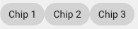 |
Orientation.vertical | Determines that components on the flexbox will be displayed vertically one next to each other. |  |
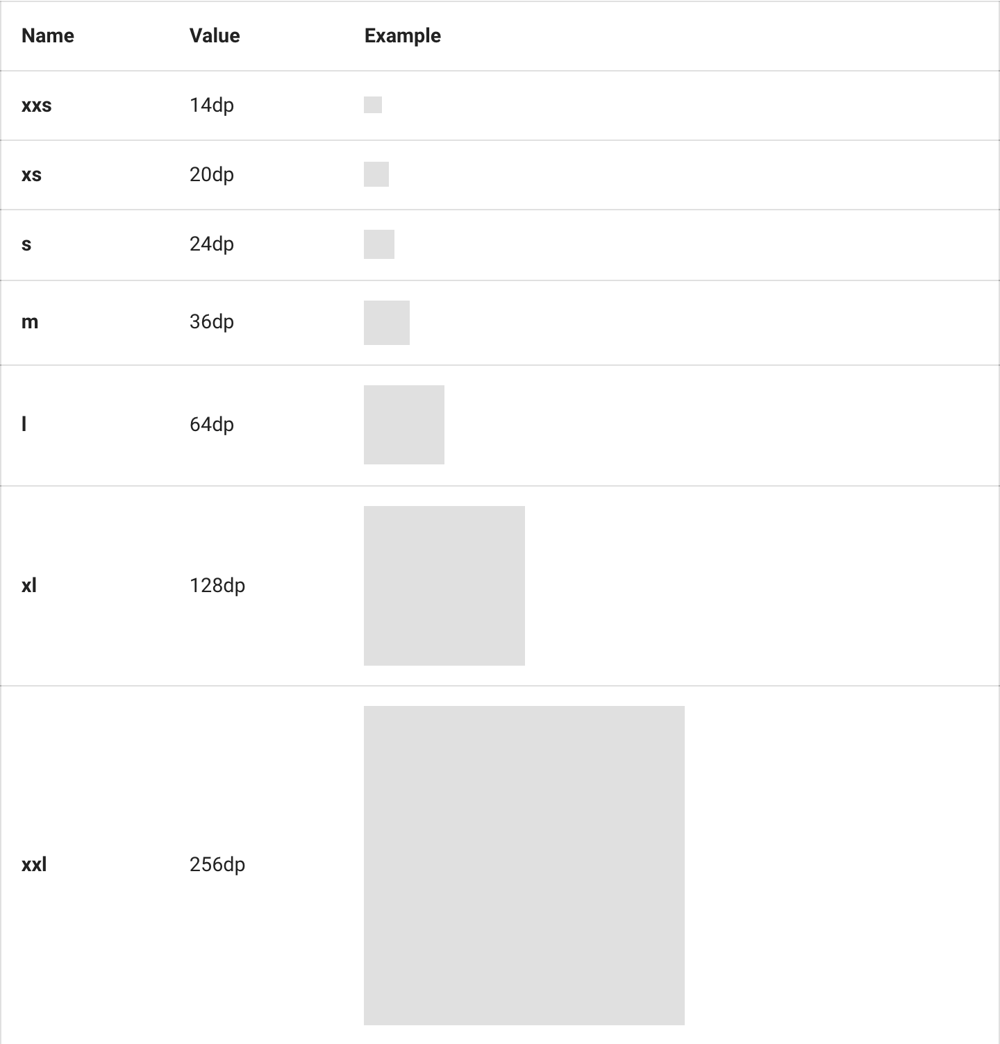
Size
window.lumapps.customize(({ constants }) => {
    const { Size } = constants;
});
Size is a key/value object that provides the possible sizes for a component.
ThumbnailVariant
window.lumapps.customize(({ constants }) => {
    const { ThumbnailVariant } = constants;
});
ThumbnailVariant is a key/value object that provides the possible variants for a thumbnail
| Option | Description |
|---|---|
ThumbnailVariant.squared | Determines that thumbnail is displayed with a square border. |
ThumbnailVariant.rounded | Determines that thumbnail is displayed with a rounded border. |

render
The render function allows to display components in a specific placement targetting a specific target. It has two use cases:
- Render components without a context.
- Render component with a context
The render function can be executed in order to create components that will be displayed in a given placement and target.
window.lumapps.customize(({ targets, components, render, placement, constants }) => {
    const { Message } = components;
    const { Kind } = constants;

    render({
        placement: placement.ABOVE,
        target: targets.PAGE,
        /**
         * Message has no relation with the context of the page.
         */
        toRender: Message({
            className: 'general-message',
            kind: Kind.info,
            children: 'Message above all pages',
            hasBackground: true,
        }),
    });
});
render is a function that allows rendering a component in a specific target and placement. The render function accepts an object with the following properties:
| Option | Description | Is required? | Option type | Default Value |
|---|---|---|---|---|
placement | Where the custom component should be rendered at the specific target. | Yes | Placement | undefined |
target | What section of the LumApps application is targeted by this customization. | Yes | Target | undefined |
targets | What sections of the LumApps application are targeted by this customization. | No | List of Target | undefined |
toRender | Single component or list of components that will be rendered at the target and placement. | Only if toRenderWithContext is undefined | Component or Component[] | undefined |
toRenderWithContext | Same as toRender but expects a function that will receive additional context specific to the given target. | Only if toRender is undefined | Function | undefined |
Context compatible targets
If the target allows it, the toRenderWithContext properties allows to render a component using additionnal context.
The render function can be executed in order to create components that will be displayed in a given placement and target.
window.lumapps.customize(({ targets, components, render, placement, constants }) => {
    const { Card, Message } = components;
    const { Kind } = constants;

    render({
        placement: placement.ABOVE,
        target: targets.USER_PROFILE_ORG_CHART,
        /**
         * The card can use the displayed user's data.
         */
        toRenderWithContext: (context) => {
            return Card({
                className: 'user-about-page__article',
                children: [
                    Message({
                        kind: Kind.info,
                        children: `Welcome to ${context.user.fullName}'s profile`,
                        hasBackground: true,
                    }),
                ],
            });
        },
    });
});
Here are the compatible targets and their received context:
Organization chart context
Organization chart context
| Option | Description | Option type |
|---|---|---|
user | The currently displayed user’s data. | object |
user options:
| Option | Description | Option type |
|---|---|---|
id | The user’s id. | string |
primaryEmail | The user’s email. | string |
profilePictureUrl | The user’s profile picture. | string |
firstName | The user’s first name. | string |
lastName | The user’s last name. | string |
fullName | The user’s full name, formatted using the current user’s locale. | string |
Widget
| Option | Description | Option type |
|---|---|---|
widget | The currently displayed widget’s data. | object |
All page targets
| Option | Description | Option type |
|---|---|---|
id | The currently displayed entity id. | string |
type | The currently displayed entity type | string |
name | The currently displayed entity name | string |
isLoading | Whether the page is loading or not | boolean |
isMobile | True if the view not desktop. | boolean |
session
window.lumapps.customize(({ targets, components, render, placement, constants, session }) => {
    const { Message } = components;
    const { Kind } = constants;

    render({
        placement: placement.ABOVE,
        target: targets.PAGE,
        toRender: Message({
            className: 'general-message',
            kind: Kind.info,
            children: `Welcome ${session.user.firstName}!`,
            hasBackground: true,
        }),
    });
});
The session object is a key/value object that allows obtaining information from the current user’s session. It is useful when the customizations that we are building need to be configured by the context in which they are executed
session.device
Contains information related to the current device used to display LumApps.
| Option | Description | Option type |
|---|---|---|
session.device.isSmall | Whether the current device is a small (< 350px) device. | boolean |
session.device.isMobile | Whether the current device is a mobile (>= 350px and < 480px) device. | boolean |
session.device.isDesktop | Whether the current device is a desktop (>= 1024px and < 1280px) device. | boolean |
session.device.isWide | Whether the current device is a wide ( >= 1280px) device. | boolean |
session.instance
Contains information related to the current instance (also known as site).
| Option | Description | Option type |
|---|---|---|
session.instance.id | ID of the current instance. | string |
session.instance.slug | Slug of the current instance. | string |
session.instance.subtitle | Subtitle of the current instance. | Key/value object where the key is a language id and the value is the translation |
session.instance.title | Title of the current instance. | Key/value object where the key is a language id and the value is the translation |
session.instance.isDefaultInstance | Whether the current instance is the default one. | boolean |
session.instance.publicContentAuthorized | Whether the current instance allows public content or not. | boolean |
session.instance.langs | List of the configured languages for the current instance. | string[] |
session.instance.name | Name of the current instance. | boolean |
session.instance.logo | Logo of the current instance. | boolean |
session.instance.parent | Parent id of the current instance. | boolean |
session.isConnected
Boolean that shows whether the current user is connected or not.
session.language
Id of the language currently used to display the site for the current user.
session.organization
Contains information related to the current organization (also known as customer).
| Option | Description | Option type |
|---|---|---|
session.organization.id | ID of the current organization. | string |
session.organization.slug | Slug of the current organization. | string |
session.organization.name | Name of the current organization. | string |
session.organization.enabledFeatures | List of enabled features for the current organization. | string[] |
session.user
Contains information related to the current logged in user.
| Option | Description | Option type |
|---|---|---|
session.user.id | ID of the current user. | string |
session.user.firstName | First name of the current user. | string |
session.user.lastName | Last name of the current user. | string |
session.user.fullName | Full name of the current user. | string |
session.user.isAdmin | Whether the current user is an admin of the current instance or not. | boolean |
session.user.instancesSuperAdmin | Instances id where the current user is admin. | string[] |
session.user.isSuperAdmin | Whether the current user is an admin of the current organization or not. | boolean |
session.user.lang | Default language for the current user. | string |
session.user.langs | Alternative languages for the current user. | string[] |
session.user.primaryEmail | Primary email of the current user. | string[] |
session.user.profilePictureUrl | Profile picture URL of the current user. | string[] |
session.user.emails | Emails associated to the current user. | Email[] where Email is { address: string; primary: boolean } |
session.navigations
Contains two Promises, one for the main navigation and another one for the subnavigation, that allow to retrieve the navigation items displayed on the site. These promises are fulfilled once the data is retrieved by the LumApps web application.
| Promise | Description | Returned type |
|---|---|---|
session.navigations.getCurrent | Retrieves a promise that fulfills with the information needed to render the main navigation of the site. If the main navigation inheritance feature is activated and the site has a parent site, this promise will return the data to render the site’s sub navigation. | NavigationItem[] |
session.navigations.getParent | Retrieves a promise that fulfills with the information needed to render the parent navigation of the site. If the main navigation inheritance feature is activated and the site has a parent site, this promise will be defined. If that is not the case, then this promise will be null | NavigationItem[] |
NavigationItem
| Option | Description | Option type |
|---|---|---|
navigationItem.id | Navigation item id, which is the ID entered in the administration page. | string |
navigationItem.uid | Navigation item UID. | string |
navigationItem.url | Navigation item URL, which should be the URL printed on the link for this navigation item. | string |
navigationItem.title | Key/value object where the key is a language id and the value is the title for the item in that language. | Record<string, string> |
navigationItem.parentInstance | Id of the parent instance associated to this navigation item. | string |
navigationItem.className | Navigation item class, which is the class entered in the administration. | string |
navigationItem.classes | Navigation item classes, prefixed with main-nav__child--${class}. string[] | |
navigationItem.hasItems | Whether the navigation item has items as children of itself or not. | boolean |
navigationItem.isActive | Whether one of the navigation item’s children is the current page or not. | boolean |
navigationItem.openInNewTab | Whether the navigation item should be opened in a new tab or not. | boolean |
navigationItem.isCurrentUrl | Whether the navigation item is the current URL or not. | boolean |
navigationItem.isVisible | Whether the navigation item should be displayed or not. | boolean |
navigationItem.type | The type of the current navigation item. | string |
navigationItem.items | List of navigation items that have the current navigation item as a parent. | NavigationItem[] |
navigationItem.link | Key/value where the key is a language id and the value is the external link for the item in that language. This value is not empty when the navigation item URL points to an external URL, outside of LumApps | Record<string, string> |
navigationItem.title | Key/value where the key is a language id and the value is the slug for the item in that language. This value contains the text that should be displayed on the navigation item. It takes into consideration the title of the item to display and if there is a specific override for that item’s title | Record<string, string> |
navigationItem.slug | Key/value where the key is a language id and the value is the slug for the item in that language. | Record<string, string> |
Using the API
The API provides several functions that can be used in order to customize your site.
setText
window.lumapps.setText('search-box', {
    en: 'Explore',
    fr: 'Explorer',
    es: 'Explorar'
});
setText is a function located at the lumapps variable that allows to change the text of a specific component. It has two parameters:
- The id of the component that we want to change the text for
- A key/value object where the key is the id of the language and the value is the text to display on the component.
These are the possible components that can be changed:
search-box: will change the placeholder displayed on the Search box component on the top bar.
These are the available languages with their ids:
- de: German
- en: English
- es: Spanish
- fi: Finnish
- fr: French
- hu: Hungarian
- it: Italian
- ja: Japanese
- nl: Dutch
- pl: Polish
- pt_br: Brazilian Portuguese
- pt: Portuguese
- ro: Romanian
- ru: Russian
- th: Thai
- uk: Ukranian
- vi: Vietnamese
- zh_tw: Chinese Traditional
- zh: Chinese Simplified
disable
window.lumapps.disable('favorites');
disable is a function located at the lumapps variable that allows to disable specific features of LumApps’s UI. This is extremely useful in order to avoid certain components to retrieve unnecessary information that we do not want to display on the site. It only accepts one parameter and that is the id of the component to disable.
These are the ids of the components that can be customized:
- Favorites
- Navigation
- Navigation UI
- Sub navigation
- Sub navigation UI
- Search box
- Bookmarks
- Contribution button
getCurrentContent
window.lumapps.getCurrentContent();
getCurrentContent: Function that returns the current content displayed on the page. Since this content changes between pages, this is not a variable but rather a function. Upon executing this function (const content = window.lumapps.getCurrentContent()), we will retrieve the following information of the current content:
| Option | Description | Option type |
|---|---|---|
id | Id of the current content. | string |
slug | Slug of the current content. | key/value object where the key is a language id and the value is the slug of the content in that language |
title | Title of the current content. | key/value object where the key is a language id and the value is the slug of the content in that language |
author | Email of the current content’s author. | string |
authorId | Id of the current content’s author. | string |
canEdit | Whether the current user can edit the content or not. | string |
customContentType | Id of the current content’s type. | string |
type | Type of content. | page or community |
isHomePage | Whether the current content is the home page or not. | boolean |
loadedWidgets | List of widgets currently loaded on the page, grouped by their id | Record<string, object[]> |
These are the current options that we support and maintain. Any other properties that might be returned when executing window.lumapps.getCurrentContent() are not guaranteed to be there in future releases of this API nor do we guarantee that they return stable values between navigations and pages.
getInternalUrl
window.lumapps.getInternalUrl();
getInternalUrl: Function that returns the relative LumApps URL for a given slug. For example, if you want to create a link that points towards a content that has the slug /content, creating an a with href="/content" won’t work, since LumApps URLs have several other slugs and prefixes in place. In order to obtain the relative LumApps URL, you need to execute the following code:
const url = window.lumapps.getInternalUrl('/content');
displayNotification
Allows displaying a notification at the bottom right hand side of the page. This notification will be displayed for 6 seconds and then it will be automatically hidden. It currently accepts two parameters:
kind: the kind of message displayedmessage: the message to be displayed on the notification. This can be combined withsession.languagein order to display a different message in different languages.
window.lumapps.customize(({ session, constants }) => {
    const { language } = session;
    const { Kind } = constants;

    const message = {
        en: 'Success!',
        es: 'Éxito!',
    };

    window.lumapps.displayNotification(Kind.success, message[language]);
});
addWidgetFilters
The addWidgetFilters function allows you to add custom filters to widgets on your site. This function is available in two locations with different capabilities:
Top-level function (Legacy)
window.lumapps.addWidgetFilters(filterConfig);
Important: The top-level window.lumapps.addWidgetFilters() function does not support public site customizations. Filters added using this method will only work for authenticated users.
Within customize callback (Recommended)
window.lumapps.customize(({ addWidgetFilters }) => {
    addWidgetFilters(filterConfig);
}, { shouldRenderOnPublicSites: true });
Important: When using addWidgetFilters within the window.lumapps.customize callback, the function supports public site customizations when the shouldRenderOnPublicSites configuration option is set to true. This allows widget filters to work for both authenticated and anonymous users on public sites.
Recommendation: Use the addWidgetFilters function within the customize callback to ensure compatibility with public site customizations and future updates.
// Example: Adding widget filters with public site support
window.lumapps.customize(({ addWidgetFilters }) => {
    addWidgetFilters({
        // Your filter configuration here
    });
}, { shouldRenderOnPublicSites: true });
See the Public Site Customizations Security section for more information about enabling and using public site customizations safely.
addSearchFilters
The addSearchFilters function allows you to add custom filters to global search and Ask AI features on your site. This function is available in two locations with different capabilities:
Top-level function (Legacy)
window.lumapps.addSearchFilters(filterConfig);
Important: The top-level window.lumapps.addSearchFilters() function does not support public site customizations. Filters added using this method will only work for authenticated users.
Within customize callback (Recommended)
window.lumapps.customize(({ addSearchFilters }) => {
    addSearchFilters(filterConfig);
}, { shouldRenderOnPublicSites: true });
Important: When using addSearchFilters within the window.lumapps.customize callback, the function supports public site customizations when the shouldRenderOnPublicSites configuration option is set to true. This allows search filters to work for both authenticated and anonymous users on public sites.
Recommendation: Use the addSearchFilters function within the customize callback to ensure compatibility with public site customizations and future updates.
// Example: Adding search filters with public site support
window.lumapps.customize(({ addSearchFilters }) => {
    addSearchFilters({
        metadataIds: ['your-metadata-id'],
    });
}, { shouldRenderOnPublicSites: true });
filterConfig options:
| Option | Description | Is required? | Option type | Default Value |
|---|---|---|---|---|
metadataIds | List of metadata IDs to filter search results and Ask AI by. | No | string[] | undefined |
Use cases:
- Filter search results based on custom metadata or business logic
- Apply contextual filters to Ask AI queries based on user attributes or session data
- Restrict search results to specific content types, communities, or categories
- Add dynamic filters based on user permissions or roles
See the Public Site Customizations Security section for more information about enabling and using public site customizations safely.
CSS classes
Our Design System provides a set of classes that can be reused in order to style our components while maintaining a visual coherence with the rest of the site. These classes can be passed in when using the className option for each component, or when you are using the RawHTML component. These CSS classes need no custom CSS, they are available out-of-the-box. If you want to implement custom CSS, please take a look at that documentation here
Spacing
Use spacing utility classes to add margins or paddings to elements.
- Our spacing base unit metric is
8. - Classes are prefixed by
lumx-spacing-marginfor margin andlumx-spacing-paddingfor paddings. - The directions available for the spacing classes are
top,right,bottom, andleft. - You can use the
verticalshortcut for bothtopandbottom,horizontalfor bothrightandleft, and nothing for all sides. - Use the
tinythroughhugescale to choose the size needed. - You can also use
noneas the size on any of the directions to enforce zero margin.
For example, this component has margins on the left (16px), top and bottom (8px) sides, but nothing to the right:
The CSS classes used for this are lumx-spacing-margin-vertical-big (which provides 8px of margin to top and bottom) and lumx-spacing-margin-left-huge (which provides 18px of margin to the left)
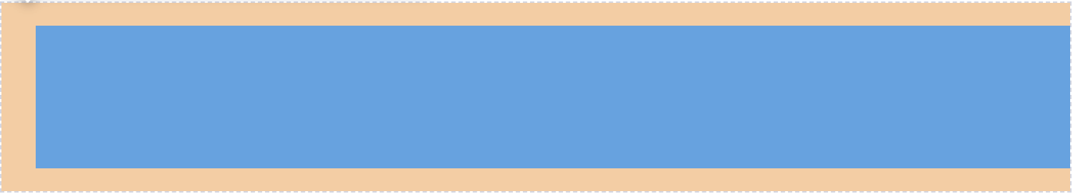
The same thing can be done to specify a padding for a component. For example, this component adds a padding of 24px to the component.

The CSS class used for this is lumx-spacing-padding-huge.
Sizes range from tiny to huge, where tiny is 4px, regular is 8px, big is 16px and huge is 24px.
Typography
There are also several CSS classes that can be used to specify the size of the text to be displayed.
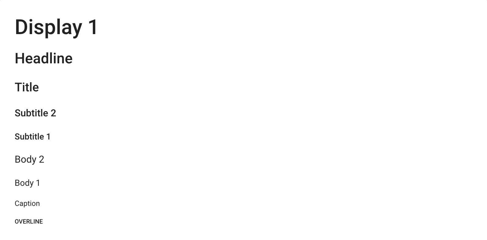
<p class="lumx-typography-display1">Display 1</p>
<p class="lumx-typography-headline">Headline</p>
<p class="lumx-typography-title">Title</p>
<p class="lumx-typography-subtitle2">Subtitle 2</p>
<p class="lumx-typography-subtitle1">Subtitle 1</p>
<p class="lumx-typography-body2">Body 2</p>
<p class="lumx-typography-body1">Body 1</p>
<p class="lumx-typography-caption">Caption</p>
<p class="lumx-typography-overline">Overline</p>
Maximum width
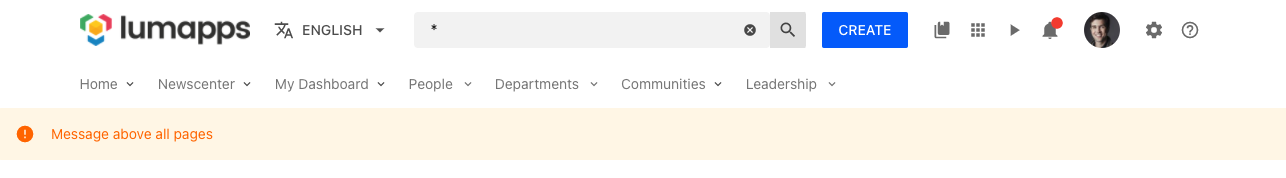
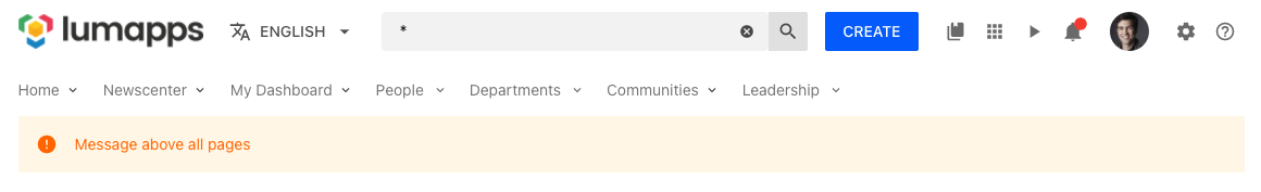
LumApps web application has a maximum width for the components displayed, which can be noticed on the top bar components such as the navigation. In order to reuse this logic, you can use the css class customizations-wrapper in your components, which will then force the width of your customization to the exact same width as the other components of the site, while considering the application’s look and feel on smaller devices.
Without the class customizations-wrapper:
With the class customizations-wrapper:
Using icons
There are several components that have an option to configure a specific icon. On LumApps we use Material Design icons as the icons for our platform. The different icons that are available is quite extensive (around 4000+) and you can find icons and their IDs on the Material Design site.
Those icons are not provided to you by LumApps, but directly by the owner(s) of the Pictogrammer website, under the licences available at https://pictogrammers.com/docs/general/license/.
In order to retrieve the ID to be used on your customizations, you can go to the Material design site, click an icon and take a look at the details of the icon. A modal window will be displayed:
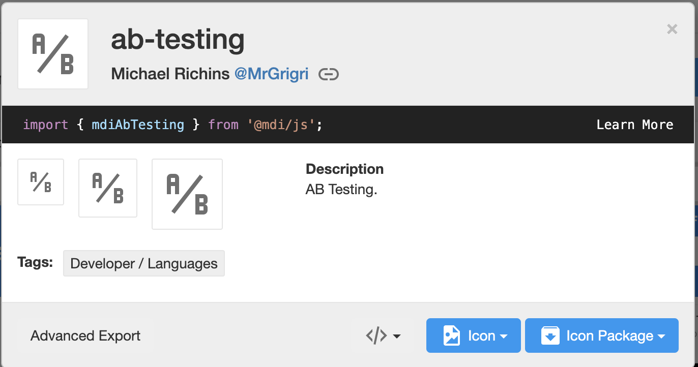
The ID is the modal’s title. In the example, it is ab-testing.
<Icon icon="ab-testing" />